25 Ideas Of How To Incorporate Orange, Pink and Coral Into Your Home

When we think of French interiors, we think of pale blue, gray and white, yet French decorating isn’t just one a one-color palette. Pink, salmon, and coral are often associated with the Rococo period and was in fashion until the end of the 18th century. Today we don’t see many interiors based on these colors alone, and I ask myself why? Pastels are some of the most beautiful colors that a person can work with, and yet most of us gravitate towards the neutrals such as the gray and beige tones. I think for the most part, many of us are scared to use color, because we don’t know how to incorporate color.
The Rococo developed in the early part of the 18th century in Paris, France as a reaction against the grandeur of Baroque where most of the pastel tones came into fashion. If you enjoy the bold shades of scarlet, cerulean, pacific blue, or shamrock green, consider working with the sibling colors such as seashell pink, peach, sea green, mint and sky blue as your main color shade in your home, while incorporating the bolder colors with accessories. The combination of pale blue and coral are great matches for one another.
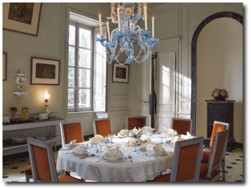
-In this picture we see a combination of a pastel pink with an ice blue. Both colors look terrific together.
–Fushia table cloths are paired with cinnamon and saffron in a French Provence cafe
-Menton Provence shows wonderful architecture in shades of coral and pink. Shades of blue in the sky and ocean work so beautifully together.
-Ceiling arches in the Royal Arcade in London. Brighter orange is paired with peach and gray ornaments. The look is amazing. Go Statue On Ebay is the number one place I purchase my molds. I have found so many great designs that could work on the wall from this store.
-A Courtyard with a fountain in Aix-en-Provence, France shows a building painted in shades of peach with sky blue shutters.
-A village in Provence shows beautiful colors of orange and blue in the architecture.
–Vibrant pinks are seen in the street of Villefranche-sur-Mer, Cote d’Azur, France
-Take some color combinations from nature. Combine earthy oranges with punchy greens in your interior color choices.
-Here is an excellent example of using three base colors in a room. The rule many designers go by is using no more than three main colors. In this photograph we see that rule play out nicely. Earthy orange is used as a base coat, followed by a sky blue, and a vibrant shade of orange is used as the second accent color.
-Here we see an unusual combination using pink as the base color, and blue as a secondary color. Emerald green is chosen for an accent color, nicely fitting in with Provence style.
-Here is a beautiful combination of colors. Here we see a chapel with lavender field. The chapel is painted in a light peach color with a vibrant color of orange for the roof. In this instance, lavender and green are accent colors to peach and orange.

Recreate An Old French Provence Chateau Look In Your Own Home
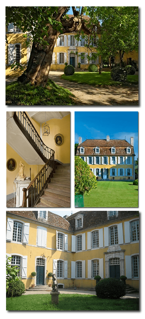
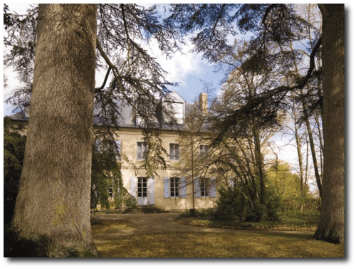
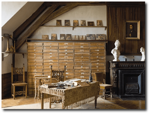
Aurélien Deleuze and his wife, Pascale, have ren0vated this sensational old world 1700′s chateau that was originally built by an minister who was knighted by Louis XIV. The home sits in the town of Pau, in south of France and has a distinct French country flavor which can be seen in the furniture and the architectural choices.
Whether you are re-decorating with French tastes in mind, or a life-long admirer of the Provence style, this house is certainly one to study.
The couple were not afraid of tackling such a magnificent structure, as they were lovers of architecture and interior design. Their restoration preserved all the beautiful details, and gorgeous antiques and decor were found at the local Parisian flea markets which added to the period touches of the home.
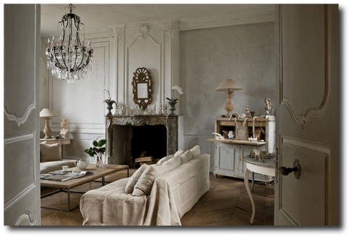
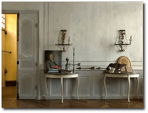
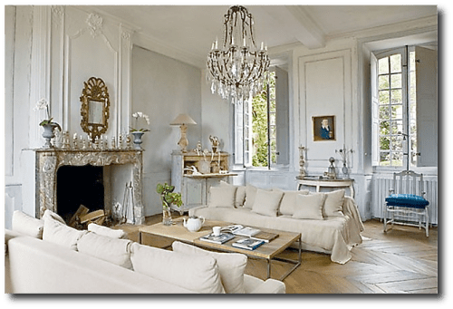
Inside, you will see captivating stucco ceilings, and painted plaster walls that are magnificently detailed. Consider getting the look of their living room by painting your walls a light blue and working with blue and beige furnishings. Demilune tables line the wall in a light painted ivory finish. Linen is casually draped over the sofas with matching throw pillows. The furniture makes this room comfortable, yet functional, and still holds to the aesthetic period style of the home.
In this post below we have collected the very best Linen furniture on Amazon with a French flare. Consider working with all-natural fabrics in your home to achieve that rustic old world charm.
–Linen- Decorating Ideas For Your French Provincial Home
A Swedish secretary in a light blue sits in the corner of the room, and a reclaimed wood coffee table float in between the sofas. Furntiure is distressed and worn showing years of love and use.
In this picture we zoom in on the country French chair with the velvet upholstery sitting along the wall in the Deleuze’s home. In the post we list a chair made from Currey & Company whom sells a terrific reproduction chair almost identical to Deleuze’s chair, listed at 2,138.00. If that is a bit pricey, consider shopping on ebay under “Country French Chair” and comparable chairs will surface for lower price points.
In the picture the chair seems to have a rich velvet cushion which highlights the blue tones in the antique painting on the wall. The bright blue also works nicely picking up the hue of the wall color and the painted secretary in the corner. This painted Louis XV chair has the same rich velvet blue tone seen in the cushions making this fabric a supreme choice for your furnishings. Velvet is usually rich in color and adds vibrant touch to a muted color palette.
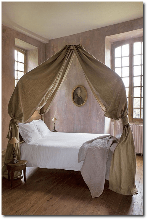
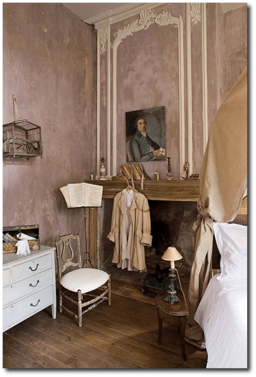
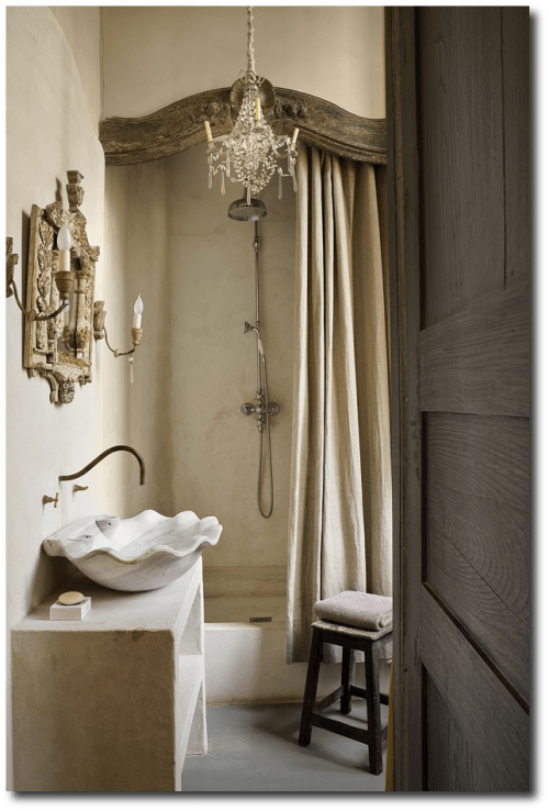
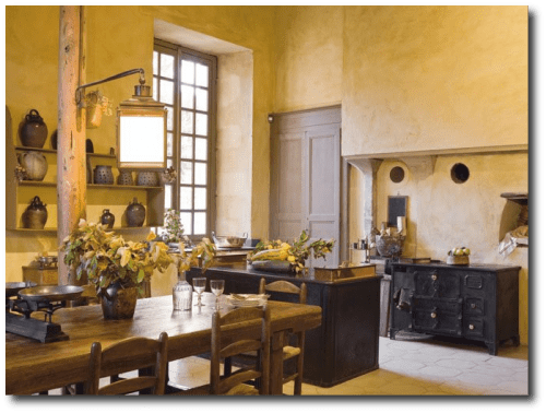
The living room is based around blues, and the faux finishes found in their bedroom and bathroom give this home a historical presence. The home retains the original floors, and the over sized kitchen has an impressive fireplace from the 1600s that brings warmth to those cold windy nights. In the dining room, a rustic plank table serves as a long traditional table for friends and family to gather around for traditional French dining.
–GET THE LOOK: Old World Reclaimed Wood Farm Tables For Your
Kitchen
–Reclaimed Distressed Rustic Wood Coffee Tables Fit In Perfectly With This Style
–29 Of The Best Rustic Iron Hardware For Your Provence Chests
See additional photos at Gilles Trillard’s Website , Property’s website: Magie des Lieux. If you like this article, please leave a comment, and pin it on facebook and pinterest, and come again!
How To Recreate A 17th Century French Provence Chateau Look In Your Own Home – Part 2
Save

How To Recreate A 17th Century French Provence Chateau Look In Your Own Home – Part 2
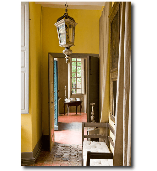
Here we see a new picture of the hallway from a different angle. Bright yellow has always been a staple color for country French decorating. Look how the trim is painted in a greenish gray tone. White is used on the shutters while the walls feature a deep hue of yellow. Linen drapes hang on the wall, where an antique bench sits with a white cushion.
Borrow some of these Provence elements of this home for yourself.
If you are looking for great set of candlesticks, check out Jack’s Candle Stands from IMAX.
The candlesticks are made of turned aluminum and finished in black sheen. The candlesticks have a wonderful footed design with incredible shape. The set of three feature graduating sizes, and would look terrific paired together for an impacting statement. The dimensions of the candlesticks are 14-20H x 4.75-5.25D and have been discounted to $96 dollars from $175.
Candlesticks sold in sets should always be positioned together for a dramatic statement. Place them on a bed stand ,console table or any where you need a punch of design. Add ornate candle sticks in your home to get that primitive feel amongst your modern conveniences.
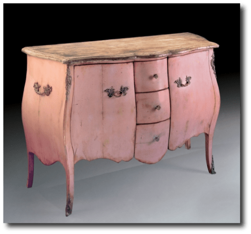
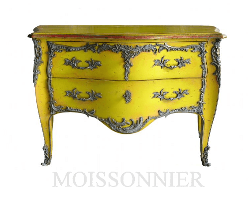
Commode – Moissonnier Furniture
Other Provence Decor Considerations:
-Buy this set for only $90 Dollars! 3Pc finial set – stone grey & gold leaf
-Thus Foreside prosecco pitcher, certainly looks Provincial! By Foreside $34
-Make floral arrangements from this lovely set of three round bowl with Feet – Antique Silver Finish $30. Use it as a candy bowl or to dress up your bathroom. Store soaps or face cloths for guests.
-America Retold sells a set of 6 dish with cloche Set For $87
-America Retold sells this trophy centerpiece perfect for the center of the table.
– Decorate with this lovely planter which features and antique style garden chicken wire cloche for $32
-The Apollo pedestal is a great distressed stand perfect for an over-sized urn. Sit it in front of a mirror or a window or at the end of a hallway. This stand sells for $259
-This Lester Iron Glass Bar Cart is the perfect cart to display your dishware that is too nice to sit behind cabinet doors. Stack your white table ware and wine glasses on for the perfect display of all your silver and glass accessories.
-Buy this Copperplated Revere Bowl for a centerpiece for $53.00
-Currey and Company Provencial White 4 Light Chandelier sells for $985 Currey and Company has a number of alternatives in this same style.
-These dentiled Platinum Chargers have a period flare. This set of 4 sells for $23.60. It is easy to collect, when the price point is so affordable!
-This medium metal cloche makes a great decorating piece for a counter or bathroom bookshelf. It is for sale for $30
-This terrific console table has so much potential. It can be painted and distressed to match your interior. It features terrific detail and is one of the nicest demilunes on Amazon. Universal Lighting And Decor sells this table for $329
-Decorate the outside of your home with this painted old fashioned watering can, sold for $53
-Imax sells this set of 5 candle-holders that have great painted patina for just over $100. Imax also sells this set of 5 candle-holder set in rustic wood for $138. Split them up into different rooms of your home.
-Hang this mini pot holder above your kitchen sink. It has a metal finish, which fits perfectly into the Provincial decorating scheme. It is only $20 dollars
-You will adore this lovely set of mini lion bowls. The set of 6 sells for $10.99
-This topiary two tier large planter is a great planter to line up in a row outside your home. This great planter sells for $40 dollars
Rustic Provence Decorating Ideas- Mr Aurélien Deleuze and his wife, Pascale Own This Captivating Chateau in France
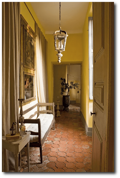
In this photograph, you can see a closer look at the Pavé French terra cotta tile floors with a distinct classic Provencal appearance. Pave Tile Blog, located in Massachusetts, were the first to develop old world French and Italian terracotta tile flooring collections from old world designs. It is surprising to know that the natural color of fired terra cottta is not naturally brown. Brown terra cotta tile is usually a result after a treatment of either wax, oil or stain.
They mention that many Americans are very predictable, when they order stone flooring. They often stick to a neutral range of beige, cream and gray colors, while Europeans fully embrace the rich earthy colors.
Why is that?
America is a very young country, and much of our architecture is fairly new. This can be said for most of the country, with exception the east coast where the earliest settled areas have a primitive British colonial heritage with respect to architecture and decorating.
Compare that to Europe. Europe is much older and the architecture can be seen as very colorful and vibrant. I have a passion for Swedish interiors particularly because of the painted finishes. This pinterest board has over 100 pins of different painted buildings featuring the most beautiful period colors. Take for example Switzerland, which borders France is rich in color. In this picture you have roof tops with hues of red, and lovely tones of yellow. In this picture of Austria, you see brighter tones of red, and light power blue in the architecture.
It can be said that when a culture is surrounded by strong colors, they also feel comfortable decorating around those same tones. People who lived in the countryside of France often decorated with the colors they saw in their backyard. Yellow sunflowers, purple Lilac, and the greenery were tones they felt inspired by.
I believe the reason why the western culture chooses more earth tones is the architecture is based around the same color ranges. If you look anywhere in America, the color palette is pretty modern. Concrete roads are gray and beige and architecture is modern rather than antique which you see in Europe. As a person ventures into the country, more painted homes appear in various shades.
See additional photos at Gilles Trillard’s Website , Property’s website: Magie des Lieux. If you like this article, please leave a comment, and pin it on facebook and pinterest, and come again!
How To Recreate A 17th Century French Provence Chateau Look In Your Own Home – Part 3
Save

How To Recreate A 17th Century French Provence Chateau Look In Your Own Home – Part 3
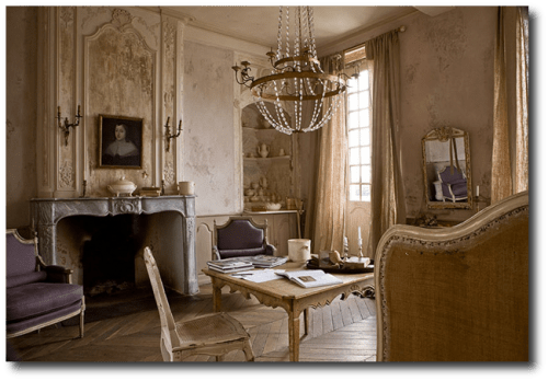
This photo of the Deleuze’s home is one of the most captivating pictures taken of the home.
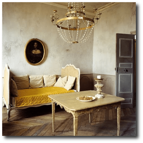
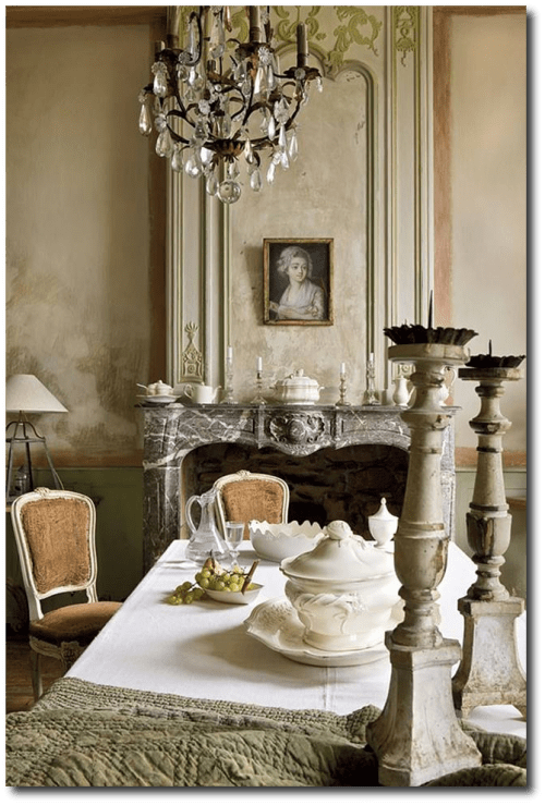
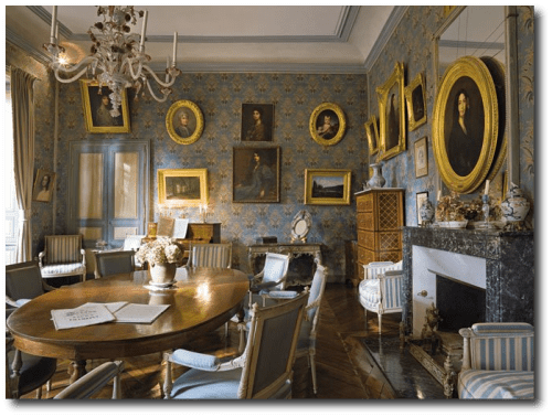
It seems as this room has several tones of peach and orange which happen to be in the same color family. The soft patina of the fireplace works nicely with the plaster paint tones of the wall and drapery. The grape upholstered chairs add a pop to this interior. A table is positioned in the center of the room with an accent french caned chair.
You can see how this room appears to be soft and the overall effect is much like you would get with gray, but with a slight hue of color! The wood floors pick up the carmel tones of the room quite nicely.
In America we are are used to seeing ceiling and trim colors painted in white, so it is natural for many people to feel as though a painted color on the ceiling might be overbearing, but in fact, if the color is soft, and works within the same hues of the room, it actually produces a dramatic, yet subtle finished effect to the room.
-In this room we see a very rustic interior with several tones in the walls. Colors of gray, beige and white appear in the finish, and if you notice a burnt orange is used on the ceilings. The look is terrific and fits in with a period effect that you would expect out of a 17th or 18th century building.
-Martha’s Dining Room in Bedford features the same color tones as the Deleuze’s home in the above picture, yet instead of the peach tones, she uses the color tones of yellow to complete this look which are accented by her bright silver and glass accessories.
-In this post we feature several well designed rooms by Martha Stewart where in one room the ceiling is painted a light blue and the flooring, walls, trim and dishware on the walls are all within the same hue.
-In this picture by Martha Stewart she features copper tin molds with a coral salmon colored linen table cloth. The walls are painted several shades lighter within the same color family. The trim is painted in an off gray, not white for a period effect. We see the contrast in the green bottle for staging purposes. In real life, green glass would add some shine and contrast against the peach tones.
– This photo from House Beauiful features a wonderful entry way in shades of blue. We see several shades in the wall and trim paint colors. Color is brought in by the lovely display of hats, and the contrasting color tones in the mud boots. The picture frames add a touch of white.
-Create a chair railing by simply using painters tape and several shades of paint. In this photo we see a painted door with an exceptionally pretty choice of pinks. The door and the bottom trim match, while black is used as an accent color splitting the two areas up.
-Likewise in this photo, painters tape can be used to create this look. If you have always dreamed of ceiling to floor framing, this should give you inspiration, as all you need is paint. Use paint colors that are darker or lighter than the ones in the photo, the effect is terrific!
–How about Green? Pair together green and light blue for a terrific contrasting effect. Here we see incredible architectural detail with a painted effect. The result is spectacular!
– Here is a brilliant room painted in a bright green. Pay attention to the the ceiling. The mint green is just as great as white, and blends in nicely into the interior. Lighter shades of the same tones can be just wonderful for a room!
We don’t have to be afraid of color. The photo of the Deleuze’s home shows a room in the lighter Rococo period colors with a pop of brighter color in the upholstery.
Color needs to be executed with precision to get the right tones that give a period effect. Although it doesn’t need to be complicated. The way I determine my color range for a particular room is to start with the prodomenant tones that currently exist in the room. Consider buying a sample of the paint color you wish to put on the walls, but in the darkest hue of the prodoment color in the room. Then use several jars of different amounts of white and black paint to achieve the colors you are most attracted to.
In this series of pictures you can see how white is added to a paint color to get a particular lighter color tone. Purchase a sample size of the paint at your local hardware store, and a small sample size of white and black. The sample size will allow you to paint a few accessories as you decide the color that best works in the room. Paint a slightly darker shade for a vase, urn, candle sticks and so on.
I believe the reason why there is such an excitment for Annie Sloan paint is because her paints seem to be more on the historical side of color tones that have been found in the past.
I believe that the public wants fewer colors that just work well, than 1500 choices of flouresents, and dulled down tones that are hit and miss.
I find so many people confused as they walk into hardware improvement stores looking at paint samples only to second guess themselves when they get home because it doesn’t look right. Paper and Paint also detail historical color tones that have been collected from a company before they closed shop. In this pinterest board, you can see many colors from the years of 1650 and 1850.
See additional photos at Gilles Trillard’s Website , Property’s website: Magie des Lieux. If you like this article, please leave a comment, and pin it on facebook and pinterest, and come again! Don’t forget to follow me on Pinterest and Facebook.
Save

Looking For Ideas For Yellow Painted Furniture? -You Need To See This Piece!
Spring and Summer is just around the corner, and many people are looking to re-work their existing furniture. More people are being drawn to implementing lighter colors in their home, especially when it comes to painted furniture. Yellow is a really terrific color choice, and there are so many ways you can dress up a piece of furniture if you plan on painting it yellow.
The key to French Provence decorating is to start with good boned furniture. If you have the lines and the shape of the Louis XV styles, you can do wonders with paint and furniture appliques.
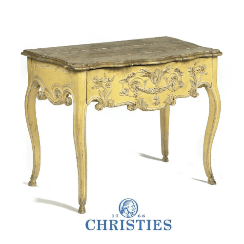
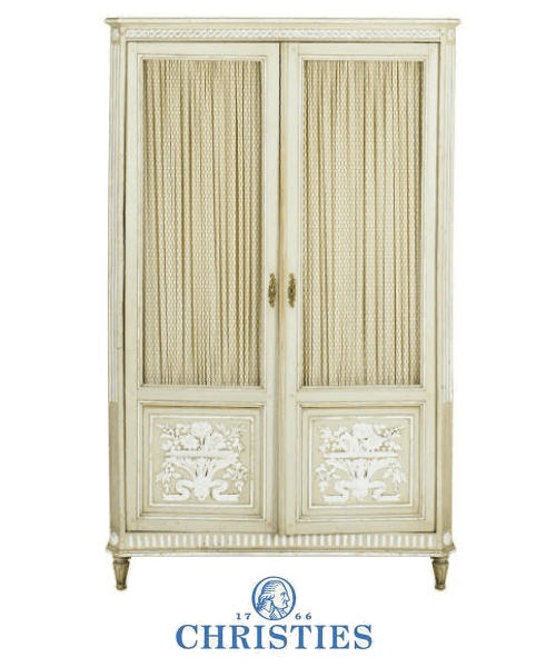
This chest featured at Christies is one of the prettiest, if not the best piece of furniture painted in yellow I have seen. The color combinations that are employed on this chest are sensational. Butter yellow, and light gray paint used to highlight the details of the console table and work beautifully together.
In some areas around the flowers, it appears to be that the appliques are whiter than others which gives the appliques a 3 dimentional apperance. This pieces appears to have some natural distressing around the painted areas adding depth to the overall look. Painting the top of the table brings the eye to differentiate the apron of the table and the table top.
One of the best features of this table are the flower and swag furniture appliques. There are many wood furniture appliques on the market today which feature historical designs which you can hammer on to your furniture.
I have written several articles on this subject.
-My Hand Painted Burl Wood Chest With Hand Made Appliques
–Look at the handles on this chest. You can add extra detail to your handles as well using molds
– Wreaths – Not A Mold, but an applique. $5.95
–Laurel Leaves Mounts– Gold Plated Metal $36.
–Mini Flower Plaque– Possibly could be used as a furniture applique.
In this article, Create A Mind-Blowing Feature Wall For Just Pennies Using Plaster Molds I explain the difference between push molds and plaster molds. Both techniques are thrilling, and I promise you, that you will love molding after trying it just once.
–This is a great little piece that could be used on furniture. $12.
Push molds are certainly the way to go to create floral appliques if you want to create a look like the French Provincial console from Christies.
–Flower Flexible Push Mold For Resin Or Clay $3.95
–Lion Head- $3.75 Add a ring and make your own Lion Pulls.
–Flower Flexible Push Mold For Resin Or Clay $3.50
–Oak Leaves– Really Excited About This! $3.00
-French Leg Mounts -$67
-Beautiful Large Scale Swag $22
–Little Oak Leaves and Acorns Clay Push Mold $2.50
–French Bow Mold– Perfect For Many Projects $3.25
–Little Holly Leaves– This has a lot of potential $3.25
–Fancy Leaf Embellishment Mold – $3.75
–Lilly of The Valley Mold- $3.50
–Rose Floral Appliques– Perfect for adding some extra detail around handles.
–Double Leaves– $2.25 Perfect For Furniture.
–Cluster of Leaves– This could be used as a ornament for French legs. Often times they are seen hammered on to the top of the legs. Use two of these upside down, or just one.
French Provincial Painted Diminutive Armoire from Christies $1,500
Bouquet Furniture Applique Mount – Do It Yourself Chic $30
Gold Ormolu is another outlet for furniture appliques. If you are wanting more of a genuine historical look, Ari’s Ormolu will have all those high-end furniture appliques.
Do it Yourself Chic also has a number of wonderful furniture appliques including the French styled swags you see on much of the antique French furniture.
–Pediment Mold– Could be used on furniture. Cast only the detail of the mold, not the backing. From Go Statue.
Save

Composer Chopin And Romantic Writer George Sand’s 18th Century French Chateau
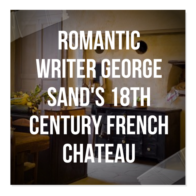
Le Domaine Nohant situated at the heart of Berry France sits a captivating Chateau built at the end of 18th Century. Chateau de Nohant was the home of the brilliant French romantic writer and journalist Lucile Aurore Dupin, otherwise known as George Sand. Her first independent novel, Indiana, was written in 1832, she went on to write thirty-seven more novels as well as various plays.
Sand (1804-1876) was also known for her shocking lifestyle, and well known famous lover, composer Frederic Chopin. Leaving her husband in 1831, she moved to Paris where she sported men’s clothing, smoked cigars and had various affairs with men, the most famous being Chopin.
When Napoleon III made himself Emperor, Sand retired to Nohant, where many summers were spent writing and composing. Frederic Chopin lived at Nohant with Sand, between 1839 and 1847, where he composed the majority of his masterpieces. Chopin composed some of his most brilliant music in George Sand’s family chateau at Nohant.
Art & Decoration originally featured these photos in their magazine. Today, tours are given through the Chateau and gardens at Nohant. See Sand’s writing nook and actual desk where she composed most of her famous works. Enjoy the chateau’s garden—classified by the French Ministry of Culture as a Notable Garden of France, and a forested path that leads to her family plot where the lady herself is buried.
Amongst all the photos, this picture featuring a carriage in front of entrance of George Sand’s manor house in Nohant, France, is the most beautiful. Another view of the dining room shows the esquisite furniture of the home. We home this classic 18th century home will inspire you with your decorating choices.
French Provincial Furniture Ideas From Photographer Bieke Claessen
- The kitchen walls in a traditional French home are often made from brick or stone. Consider troweling some plaster on the walls, or consider making your own stone out of plaster for pennies which can save you thousands when you plan on re-decorating.
- Dry herbs can be displayed in the kitchen and at the same time fills the air with their smell.
- Iron has always played an important look in the rustic countryside of France. Consider adding decor with metal elements, such as baskets which can hold linen napkins, faux fruit, or extra silverware. The table is an important part of Provence styled decorating.
- Painted furniture mixed with raw wood will you complete the look.
Here are some of my favorite picks:
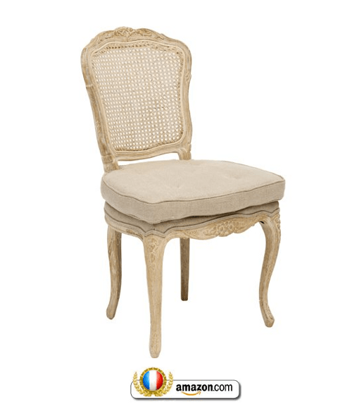
The Noah Dining chair will fit gracefully in a home that has a classic and soft aesthetic. If features a cane back that has been brought back to life and a beautifully tufted seat cushions for comfort. This chair features a cane back, and a lose seat cushion – Sells for $429
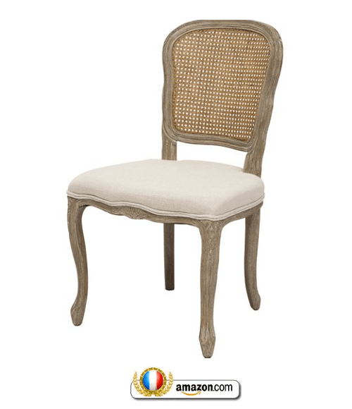
The Napoleon collection faithfully captures the romantic feel of vintage, painted furniture from the French countryside. Featuring gently curved frames made of solid hardwood, brightly colored then rubbed down on the edges. Adds a soft splash of vibrancy to any setting. The Louvre arm and dining chairs are accented with a cane back. The chair is made of kiln dried hardwoods , and constructed using Chinese Joinery . Webbing placed in the seat for support, and hand-painted and hand-distressed for that special French appeal. New, sells this Louvre dining chair for $299
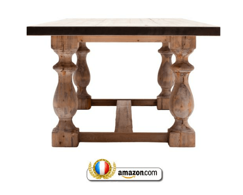
The Baltic dining table features a natural rectangular surface and an elaborate based. It would make any dining area stand out because of it’s beautiful natural elements. The table features a Kiln-dried hardwood frame. The finishes are hand applied and sanded repeatedly. The top of the table is coated with a lacquer top coat or wax. New sells this for $1,499
The most important room in the house is the kitchen and the same is said for the French Provencal look. The kitchen is where most of the entertaining is done in the home, so it makes sense to invest in quality furnishings where you spend hours of your time.
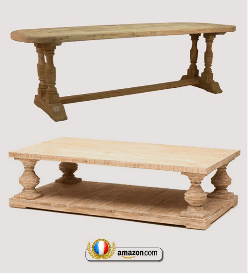
Le Havre Dining Table-Elm Wood: W98.5 x H30 x D35.5 $2,949
Reclaimed Lumber Coffee Table $1,499

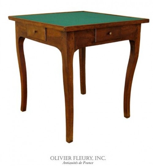
French Provincial Louis XV Style Game Table
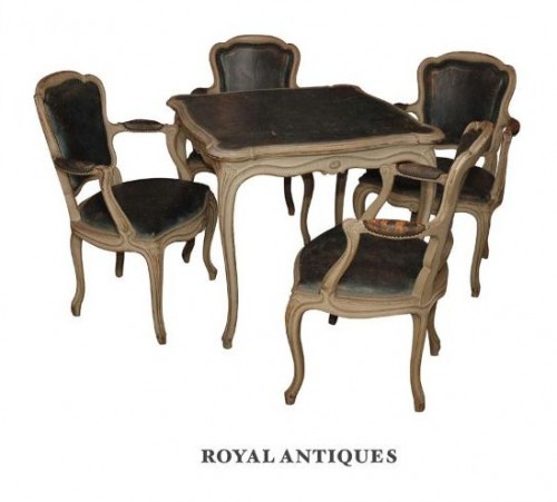 Antique French Louis XVI Style Painted Blue Leather Game Table With Four Armchairs
When you think of game tables today, the first thing that comes to mind for most people are pool tables, ping pong tables, and hockey tables. Before the modern invention of the television, a family would play games together. A game table was a very practical piece of furniture in the home, and was used daily.
Antique game tables are smaller than regular tables because they were designed with the intention of 2 people playing a game together. Larger game tables can accommodate 4 players, and sometimes more. Here is an exceptional example of a burl wood poker table that can hold 6 players.
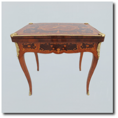
Some of the most beautiful french tables often have precious mother of pearl, ebony and wood inlay combined with bronze decorative hardware that adorned the feet and mounting corner hardware on the legs.
Many game tables have a removable chess board on one side, and the table design on the other. Other tables have a chess board on one side and a backgammon board on the other side. Small drawers are often built in for storing game pieces. Some designs actually have drink holders that pull out from the sides.
You can expect French Napoleon III period tables from the 1860’s to be painted in black lacquer or cream with gilt bronze hardware. They often have tapered fluted legs compared to Louis XV tables. French game tables make great additions to your living room. Station these tables against a window and add two comfortable bergere chairs, and you may be surprised to learn that you use it more than you think.
French Country Louis XV Game Table
Antiques Super is selling an antique French Louis XV inlaid mahogany game table. This beautiful game table is made in solid veneered mahogany and rosewood in the French Louis XVI style. This table has terrific inlaid and bronze details. Antiques Super is selling this table for $1,325.00
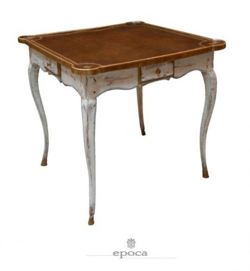 French Provincial Rococo White Painted Game Table– A charming French provincial rococo white painted and parcel-gilt leather-top game table; the square russet-colored leather top with hand-tooled gilt decoration; above a scalloped apron fitted with 4 drawers; raised on graceful cabriole legs ending in hoof feet
Save
