25 Ideas Of How To Incorporate Orange, Pink and Coral Into Your Home
When we think of French interiors, we think of pale blue, gray and white, yet French decorating isn’t just one a one-color palette. Pink, salmon, and coral are often associated with the Rococo period and was in fashion until the end of the 18th century. Today we don’t see many interiors based on these colors alone, and I ask myself why? Pastels are some of the most beautiful colors that a person can work with, and yet most of us gravitate towards the neutrals such as the gray and beige tones. I think for the most part, many of us are scared to use color, because we don’t know how to incorporate color.
The Rococo developed in the early part of the 18th century in Paris, France as a reaction against the grandeur of Baroque where most of the pastel tones came into fashion. If you enjoy the bold shades of scarlet, cerulean, pacific blue, or shamrock green, consider working with the sibling colors such as seashell pink, peach, sea green, mint and sky blue as your main color shade in your home, while incorporating the bolder colors with accessories. The combination of pale blue and coral are great matches for one another.
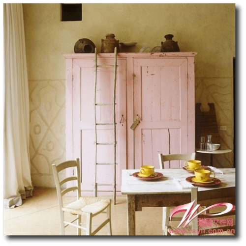
-In this picture we see a combination of a pastel pink with an ice blue. Both colors look terrific together.
–Fushia table cloths are paired with cinnamon and saffron in a French Provence cafe
-Menton Provence shows wonderful architecture in shades of coral and pink. Shades of blue in the sky and ocean work so beautifully together.
-Ceiling arches in the Royal Arcade in London. Brighter orange is paired with peach and gray ornaments. The look is amazing. Go Statue On Ebay is the number one place I purchase my molds. I have found so many great designs that could work on the wall from this store.
-A Courtyard with a fountain in Aix-en-Provence, France shows a building painted in shades of peach with sky blue shutters.
-A village in Provence shows beautiful colors of orange and blue in the architecture.
–Vibrant pinks are seen in the street of Villefranche-sur-Mer, Cote d’Azur, France
-Take some color combinations from nature. Combine earthy oranges with punchy greens in your interior color choices.
-Here is an excellent example of using three base colors in a room. The rule many designers go by is using no more than three main colors. In this photograph we see that rule play out nicely. Earthy orange is used as a base coat, followed by a sky blue, and a vibrant shade of orange is used as the second accent color.
-Here we see an unusual combination using pink as the base color, and blue as a secondary color. Emerald green is chosen for an accent color, nicely fitting in with Provence style.
-Here is a beautiful combination of colors. Here we see a chapel with lavender field. The chapel is painted in a light peach color with a vibrant color of orange for the roof. In this instance, lavender and green are accent colors to peach and orange.
Quick Tips For Working With Pink, Orange and Coral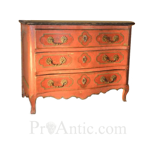
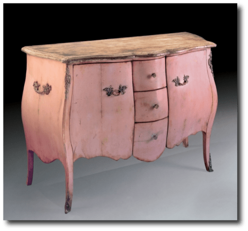
Louis XV Commode Painted Wood. Convenient to Louis XV- Proantic Antiques
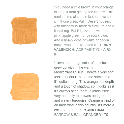
12 Best Shades Of Orange From House Beautiful Magazine
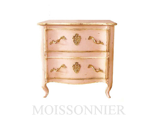
Moissonnier furniture offers you copies of 17th to 19Th Century Antiques
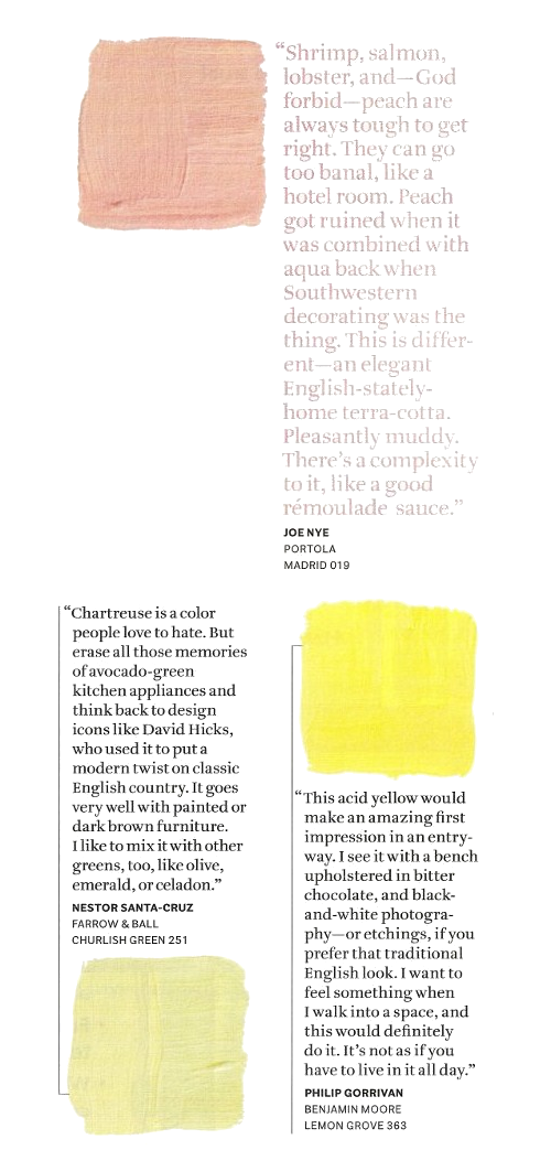
House Beautiful Magazine – The Paint Issue
-Rethink pink as an accent color in your house that you can showcase in different ways, other than the wall color. China is the perfect way to display brighter colors. Line them up on your wall using plate hooks. Throw pillows are great ways of adding pops of color on your sofa and beds. Lamps can be painted, and custom shades with fabric to match your interiors can be customized. Painting furniture is the best way to incorporate several shades of color into your home.
-Paint your walls a shade of mango, and layer in frames in copper or gold. Consider painting picture frames a burnt ochre orange, with picture mats that match the wall color. In this picture you see several shades of orange, and a brass pitcher makes a nice centerpiece.
-If you plan on working with a bright color, consider accenting it with either copper or brass. It is amazing what either metals will do for tones of pink or coral.
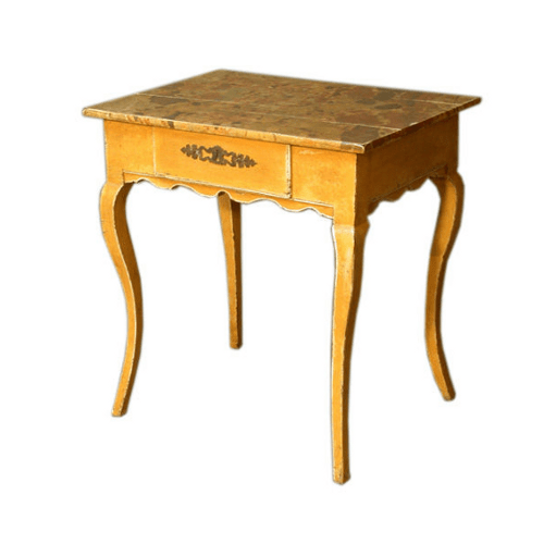
19th Century French Provincial Louis XV Painted Side Table
-Traditional Colors From The 18th AND Early 19th Centuries-A Selection of Oranges
-Traditional Colors From The 18th AND Early 19th Centuries-A Selection of Blues
-Annie Sloan Chalk Paints –Antibes Green, Barcelona Orange
-The Best Antique Framed Mats. – Get The Look For Your Walls
-The paler pinks are feminine and pretty, while the more intense shades such as raspberry, are dramatic and exciting. Shell pinks find their true complementary shades in the pale, blue-greens, but also work well with the lighter shades of blue and lilac. Use the stronger colors of such as scarlet, Persian red and crimson as accent colors.
–Color-washing the walls is an excellent way to tone down a bright color on the walls. Light gray, or pastel yellow can produce a mottled effect against a bright tone on the walls. The faded, sun-bleached corals also look great on exterior patio walls with terracotta floor tiles and plant holders to give a Mediterranean look.
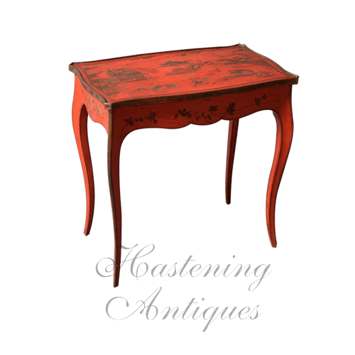
Louis XV Style Red Lacquer Side Table From Hastening Antiques
Serpentine shaped top with carved and gilded chinoiserie decoration over scalloped apron and delicate cabriole legs. Made in France circa 1900.
-Shocking pinks aren’t always the easiest colors to decorate around, although they work really well teamed with pastels in the same color tone and greens. Fuchsia pink works nicely with accents of apple green, warm golds and coral pinks. Raspberry and mulberry shades work well with pastel shades. Pale shades of bluish pink are a excellent choices for bedrooms, while the boldest, vivid colors tend to work best on accent pieces such as a painted console table, china on the wall, or seen in paintings with several other pinks combined.
Archives
- August 2022
- February 2022
- January 2022
- November 2021
- October 2021
- July 2021
- April 2021
- March 2021
- February 2021
- December 2020
- November 2020
- May 2020
- November 2019
- January 2018
- November 2017
- March 2015
- November 2014
- October 2014
- April 2014
- November 2013
- October 2013
- September 2013
- July 2013
- June 2013
- May 2013
- April 2013
- March 2013
- February 2013
- January 2013
- November 2012
- October 2012
- September 2012
- July 2012
- May 2012
- April 2012
- March 2012
- February 2012
- January 2012
- December 2011
- April 2011
- March 2011
- February 2011
- October 2010
- September 2010
- June 2010
- April 2010
- March 2010
- February 2010
- January 2010
Calendar
| M | T | W | T | F | S | S |
|---|---|---|---|---|---|---|
| 1 | 2 | 3 | 4 | 5 | ||
| 6 | 7 | 8 | 9 | 10 | 11 | 12 |
| 13 | 14 | 15 | 16 | 17 | 18 | 19 |
| 20 | 21 | 22 | 23 | 24 | 25 | 26 |
| 27 | 28 | 29 | 30 | |||
