
Book Review: French Country Living By Caroline Clifton Mogg
 With the pricy cost of books these days, often times, I like to try them out at my library before buying them. If they are great, I tend to write up a post, because an exceptional book needs to be known. This is a book worth buying! I tend to enjoy the books that reveal more of the historical properties, because they provide a unique and fresh approach to decorating. After looking at thousands of pictures for our many blogs, there are a few books in my library that I can look at over and over again, and they never become dull. This is one of those books. With close to 5 stars on Amazon, selling new for $32, and used from $8, this book can be a classic in your library.
There is a great beauty of discovering the old, the worn, something loved for years, and passed down through families. Caroline Clifton Mogg writes a number of chapters, on the elements which make a home.
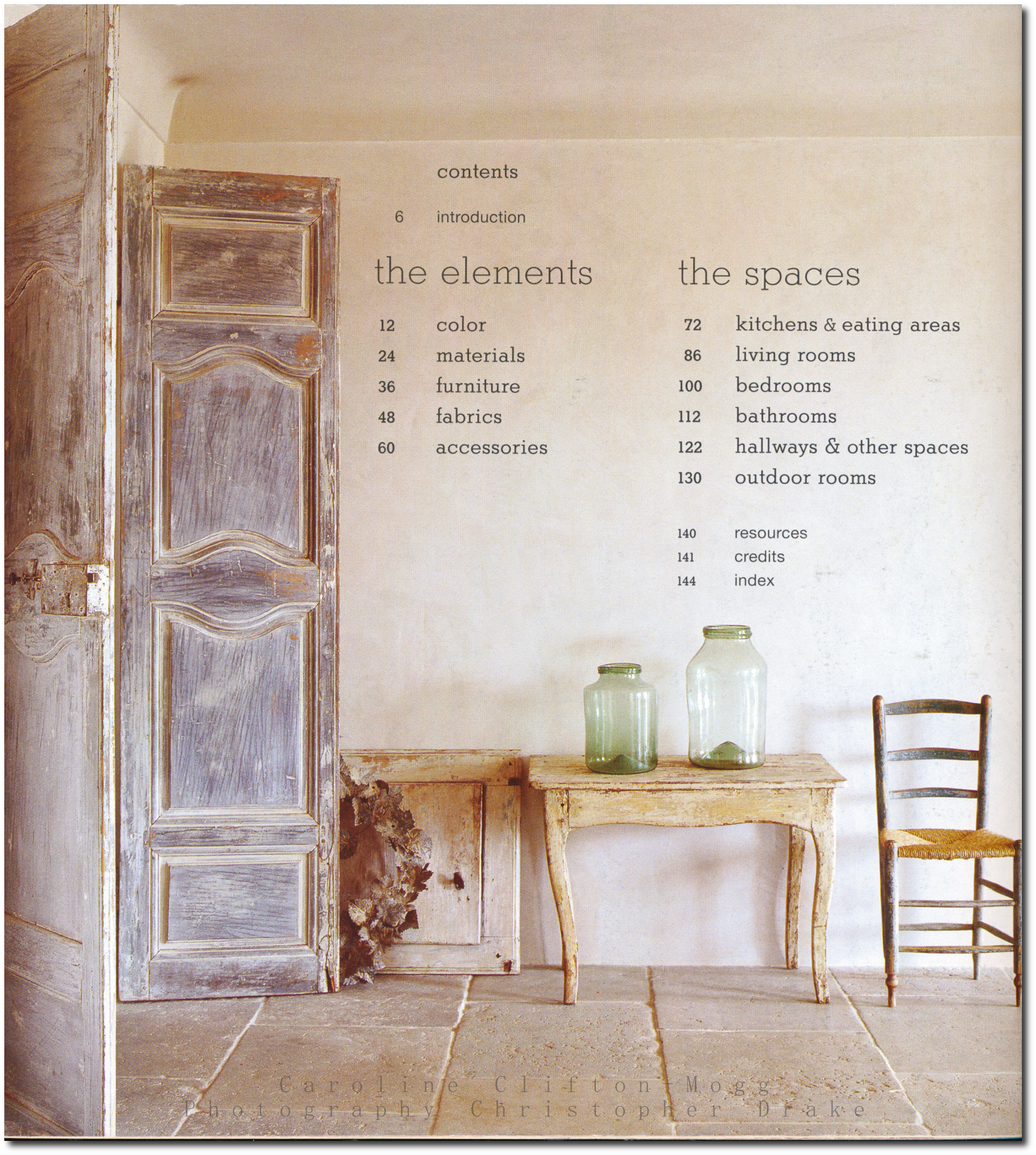
Page 12- Color, Page 24 Materials, Page 36 Furniture, Page 48 Fabrics, Page 60 Accessories, Page 72 Kitchen and Eating Areas, Page 86 Living Rooms, Page 100 Bedrooms, Page 112 Bathrooms, Page 122 Hallways & Other Spaces, Page 130 Outdoor Rooms
In this book, 140 pages covers 307 color photographs that illustrate the beauty of the French countryside. City decorating is quite different from French country decorating for the most part. The country approch is rustic, rough in some situations, and a bit more relaxed.
One review left this comment:
“If you are afraid of color, this book is for you. Don’t let it convince you, though, that french country is not about bold colors- every other book I’ve seen says the opposite. That said, it is a beatiful book, with lots of rustic elements.”
If you are looking for the saturated colorful interiors like this, this or this, this book covers more of the muted styles. Intead of rich saturated colors, it works with colors that are muted. This book certainly presents an elegant approch to the French countryside home, rather than the folk country looks with rich vibrant colors. Certainly many of these looks that the author presents can be used in the city as well as the country.
Pictures from the book featured on Blogs
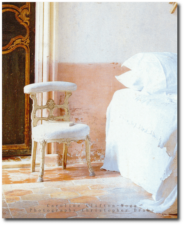
– Trouvais Blog features page 57, 13, 122
-Painted Furniture – Page 46
-Brooke Giannetti- Page 14, 50, 102, 110, 12, 18, 96, 40, 49, 27
– Aged and Gilded Blog, Page 139, 138, 76
– Paris Apartment- Page 85,
-Zsa Zsa Bellagio Blog- Page 97
Here are a couple more pictures that I cannot locate in the book:
– Spectacular French Doors, here
-A Buttercup Yellow Wall Cabinet – here
Quotes From The Book:
“From gray also come mauve and lilac—either as bright as the color of violets or or closet to the quiet, almost musty tones that are quintessential French, and which look so winning when teamed with gray green, perhaps used on woodwork. A more sophisticated combination that is sometimes seen is a gray mauve offset by a dark, almost terra-cotta red—the red known as sang de boeuf makes a particularly effective contrast. Pinks and peaches are also to be found among the range of
French country colors, but they are not childlike nursery tones—there is nothing of a sugary or sweet nature about them. Like so many French country colors, the pinks and peaches appear
almost organic, seeming as though they might have emerged from the color of the original plaster than applied on top of it, and again, they often seem to include a hint of pale ancestry”
“A wide variety of woods is evident in rural interiors,but the woods used in different parts of France
were and are largely those from the trees growing in the surrounding countryside—fruit woods such as walnut and cherry, and traditional hardwoods such as oak and elm. Exotics such as mahogany or
maple will not be found in abundance here, for self-sufficiency is the name of the game”
Reviews:
By “Caroline Clifton-Mogg’s French Country Living is a delicious book to look at; the pages are filled with beautiful, airy rooms and the accompanying text does a good job of explaining how the effect is achieved–lots of grey in the colors, painted furniture, small-sized fabric prints, etc.
By Hollygolightly- “This is French country living in the Marie-Antoinette-at-Petit-Trianon style, not truly rural la France profonde, however. The exquisitely restored rooms are filled with priceless antiques, and a cursory glance over the photo credits suggests that the majority of houses shown are located in either Provence, or the richer departements near Paris (the most famous house in Yvelines is Versailles, if that gives you an idea of what’s in the neighborhood of some of the chateaux photographed). Having seen more than one room in a rural French house with vinyl wallpaper on the ceiling and door, I can only wish that all of French country life was this beautiful! ”
By John Matlock -“In this book, hundreds of color photographs by Christopher Drake, illustrate the essence of the French countryside. The book is in two parts, the first emphasizes the soft, non-contrasting colors and the natural materials and textures that are distinctly France. The second part of the book looks at the overall style. It looks at the French home, starting of course with the kitchen (this is after all France). Only then does it move on to the rest of the house, ending with the French garden. And this is France, so the garden also emphasises a place to eat and drink.”
By Julie BarrettZiegler- Fantastic photography, and a generous, diverse selection of beautiful interiors. From iconic over-the-top French decorating, to simple Provençal country style, this book celebrates the special environments for real living evoked by good French decorating style.
By D Thoden- I got this book as a Christmas present 3 yrs ago, and it is still one of the best decorating books I have ever owned. If you like whites, creams and soft, grayish colors, along with authentic chippy antiques shown in lovely old homes, you should love this book. It’s not LOOK AT ME decorating. It’s used, comfy, old furniture and fabrics, and it’s divine. This book ultimately changed the look of my home. The holidays were especially rough that year; I missed my Mother and was sick while at my in-laws over the holidays. This book got me thru it all!!! I just laid in bed and read it and looked at the photos over and over.
By Gerard Brady -Love this book. I have all kind of pages marked for ideas. Beautiful pictures, descriptions. The book is in great shape as advertised. It will become one of my “go to” books for decorating. Love it!
By Savannah, GA USA- By I love this book for ideas and inspiration. My favorite part of France is the Loire Valley and Sologne. The pictures in this book show that classic casual style. I also love Paris, but the Parisian style is more formal and ornate. I like the brick and terra cotta floors, the wood furniture, the lavender and sunflowers of the countryside. This will take you beyond chicken figurines and calico prints! Great read, great price. Great book for daydreaming! Enjoy!I have also bought Italian Country Living by the same author. Another wonderful book.
By T. Brashear “Dessa”- Sumptuous photos of sumptuous French provincial houses, with helpful guidelines about what characterizes French country decors (though I agree with one reviewer that not too many French country houses look like this). I particularly like the author’s emphasis on how livable the style is, and find this to be true too. Buyer beware however that French country may look a lot different in an American ranch house: a lot of the charm comes from plastered stone walls, old beams and well-worn tile floors.
By Stacey M Smith- Beautiful book. Inspiring photographs that capture French country style (obviously, note the title). My only complaint about Clifton-Mogg books is that the photos are recycled. I see the same photos is many other books. There are MANY wonderful estates, villas, and country properties out there – – – it would be nice to see more of them instead of these multi-used images. The “recycles photos” are no problem if you just have one of her books – – but if you buy many European decorating books, you may see repeat photos.
Striking distressed doors with a neutral background
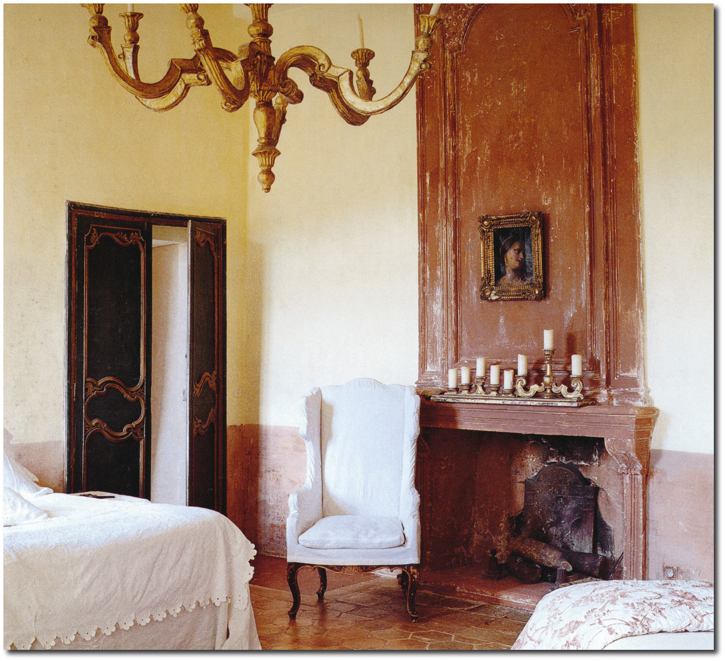
One common paint technique we don’t see today is the bottom half of a wall painted in a different color. Perhaps this was done to clone the look of wood architectural wainscoting?
It certainly looks amazing, and a look that can add a bit of color into a room,without having to paint an entire wall.
Look how the pale pink on the walls picks up the beauty of the tile. Spectacular!
This is the other part of this amazing room

Dan Carithers French Provincial Designs

Dan Carithers October 1999- Featured on Magpies and Magnolias Blog
Now retired after a 50-year career creating rooms photographed for shelter mags like Veranda, House Beautiful, Traditional Home and Southern Accents, Carithers rooms still remain current, and is often the most blogged about designer around. In 2003, Carithers was named one of House Beautiful’s “Giants of Design”—the highest honor bestowed by the magazine; it’s only been given to a handful of honorees during its 100-year history.
Dan Carithers grew up in small town Jefferson, Georgia, and first gained notoriety as the design director for home furnishings at Rich’s Department Store. The job had an added bonus of being able to travel abroad which exposed Carithers to the latest home fashions and antiques from London and Paris. Carithers launched his own firm, and also established a long-time consulting position with Baker Furniture, and created an high-end upholstery line with Sherrill Furniture.
Carithers tends to lean towards the elegant side of decorating. Antique-filled homes with bold punches of color is a signature style of Dan Carithers. He suggests to pick out your accent color first, and repeat it throughout the house. As you can see in many of his designs, he tends to use neutrals on the walls, such as chocolate browns, creams and beige. Carithers often used mirrors to expand light, using slipcovers that often left the bones of the chair exposed. He often utilizes thought-out pieces for his rooms often looking around for the perfect choice. He mentions that a chair can have great impact in the direction of a room.

Dan Carithers French Style Decorating – Carither’s Home Featured in Southern Accents

Dan Carithers French Style Decorating – Carither’s Home Featured in Southern Accents

Dan Carithers French Style Decorating Featured in Southern Accents

Dan Carithers French Style Decorating – Carither’s Home Featured in Southern Accents

Dan Carithers- Southern Accents Magazine

Dan Carithers Traditional Home Magazine

Dan Carithers French Style Decorating – Carither’s Home Featured in Southern Accents

Southern Accents Oct 1997
Kitchens I Have Loved Blog scanned in some pictures of the Carithers Home which show a provence styled interior

Carithers Home –Kitchens I Have Loved Blog

Carithers Home –Kitchens I Have Loved Blog

Dan Carithers In Veranda Magazine

Traditional HomeDan Carithers- Featured On Developing Design Blog

Dan Carithers October 1999- Featured on Magpies and Magnolias Blog

Dan Carithers October 1999- Featured on Magpies and Magnolias Blog

Dan Carithers October 1999- Featured on Magpies and Magnolias Blog

Dan Carithers October 1999- Featured on Magpies and Magnolias Blog

Dan Carithers October 1999- Featured on Magpies and Magnolias Blog

Tremolet’s Chateau d’Ailly in Normandy

Gerard Tremolet worked in the fashion world most of his life, but after leaving the industry of fashion, he pursued his own interests in interior design. Back in 2007 he and his partner purchased the Chateau d’Ailly in Normandy and renovated it to transform it into a bed and breakfast. To decorate the castle Gerard Tremolet drew his inspiration from his love of the 18th century, adding his own personal touches along the way. While the colors aren’t historically accurate, Tremolet shows us that bright, bold color can be used in period styled homes and furniture.
Saturated dark red walls in the dining area are paired with a beautiful collection of natural vintage styled baskets and blue-gray provence chairs for a nice contrast. The combination of the damask wall fabrics, striped velvet fabrics, and iranian patterns show us that even complex color combinations can work together. Colors such as yellow, turquoise, hot pink and lime are some of the colors used throughout the Chateau d’Ailly. French XV, XVI furniture, and Italian Venetian furniture and accessories are paired together giving off a look that is carefully collected and adored. A modern styled “Renaissance-style ” approach is used through the home, and can be seen in the guest bedroom. One the best rooms is shown below. The walls and curtains are of a Thevenon toile de Jouy. A Louis XV armchair sits in the bedroom and can one of the best examples of French style in the home.
To read the full article head over to Elle Decor.


Nicky Haslam’s Romantic Country House

‘Nicky Haslam’s Folly de Grandeur: Romance and Revival in an English Country House’, is Haslam’s newest book on authentic, English country style decorating.
Haslam shows interiors with carefully mismatched antique and vintage furniture, with color palettes of warm welcoming tones. From vignettes, to getting the most bang from your hallway, Haslam gives away a wealth of visual interest to the reader. Learn how to incorporate art, accessories and furniture for a home which is comfortable, yet strikingly beautiful.
Haslam shows off his own 1720 house in Folly de Grandeur. Floor plans and diagrams illustrate the homes detailed history, as well as the traditional garden, furnishings, and the details of the conservatory. Images of the house through the seasons shows his true love and attention for the home’s details. Images of his collecting from flea market finds and treasures from boot sales are captivating. He shows off upholstery, curtains, chair backs, improvised lampshades and slipcovers.
Interesting Links:
– Nicky Haslam -British Interior Designer’s Website
-Nicky Haslam’s Country House – WSJ–Nicky Haslam, renowned interior designer and London man-about-town, calls a 16th-century royal hunting lodge in the English countryside his home away from home—rose chintz sofas, portraits, flourishing garden and all
-NOW AND THEN: Dreamy English Country Cottages by Colefax and Fowler- Decor Arts Now
-1stdibs Introspective – Nicky Haslam- 1st Dibs
-Interview: Nicky Haslam- House & Home Magazine
-Oh, Nicky, You’re So Fine, You Blow My Mind, Hey Nicky! The Style Saloniste
>Other Design Books Featuring Nicky Haslam:
–Designers at Home: Personal Reflections on Stylish Living –Personal Reflections on Stylish Living presents the personal living spaces of fifty distinctive design leaders, including Charlotte Moss, Celerie Kemble, Ashley Hicks, Barry Dixon, India Hicks, Vicente Wolf, Martyn Lawrence Bullard, Kevin Sharkey, Suzanne Rheinstein, Rose Tarlow, Jay Jeffers, Michelle Nussbaumer, Jan Showers, Alex Papachristidis, Madeline Stuart, Matthew Patrick Smyth, Colette van den Thillart, Malcolm James Kutner, Ken Fulk, Scot Meacham Wood, Bunny Williams and more. These select dwellings range from chic apartments and luxurious estates, to charming country homes.
–Sheer Opulence (Decor Best-Sellers) by Nicholas Haslam
Reviews:
By L. M. Keefer
You will savor every word and image in this book as Nicky Haslam takes you on a remarkably personal tour of his folly of an English home which he describes as “quite simply the prettiest small house in the world.” Formerly the home of renowned designer John Fowler, Haslam fell in love with its “fairy-tale facade”, as Fowler did shortly after the end of WWII. Haslam describes seeing the folly for the first time: “History does repeat itself. And so it was that, some thirty years later, I turned the last bend in the rough lane through these woods, came to a clearing by a lake, and, turning, saw this rose-pink, brick-gabled folly glinting in the evening sun.”
Haslam recounts, “I like to think of him (Fowler) standing in the doorway as his celebrated clients like Debo Devonshire or the Pembrokes drew up to be greeted by his quizzical smile and promise of a nifty Blood Mary. One of his early assistants, Nina Campbell, told me recently that, even before he came to live here, John’s nickname was ‘Folly’ Fowler….”
Situated on the hunting grounds of King Henry VII, the home has a rather magical past before Fowler. It was on these grounds that Catherine of Aragon first set her black Spanish eyes on King Henry’s son Arthur, Prince of Wales, to whom she was betrothed. You may sense a certain magic pervading the house, or maybe it’s Haslam’s unabashed affection for it. In its Tudor beginnings as a refuge from hunting, it was a humble three rooms. Around 1720-40 a fanciful Jacobean facade was affixed to the front, and it was expanded.
Describing his first walk-through after Fowler inhabited it, Haslam allows us to see it through his eyes: “There was no furniture inside the house the first time I saw it…. But in each of the tiny rooms – not one is more than 12 feet wide – the walls were beautiful…. Shabby drapes, some edged in fading hand-painted borders, fell forlornly at dusty windows. Le Grand Meaulnes and Miss Havisham had nothing on this sleeping timeless Wunderkammer. And, strange as it seems now, I knew then that I must retain an echo of this delabre atmosphere; it seemed an essential element of the building’s magical being.”
You may feel you are in the midst of an E.M. Forster novel as you read this, complete with iridescent photos by Simon Upton, to accompany the descriptions.
Leaving much of the home the way Fowler left it, Haslam brings fresh life and luster to it with his original and fresh style. He says of his style: “It would be hopeless to pretend that my style, at home, is anything but a hodgepodge of the things I love….And the house’s soul doesn’t seem to object to the hodgepodge.” It seems every room and piece in the home has a story, and Haslam is happy to tell them in his colorful and amusing storytelling style. His storytelling matches his decor: charming, lighthearted, insouciant, droll and sentimental.
You may find yourself raptly reading every word and studying the pages as Haslam chats about the house and its history, walls, soft furnishings, curtains and drapery, and furniture. Then he takes you on a grand tour of the rooms: the old hall, the staircase hall, the library, the dining room, the kitchen, the flower room, the guest rooms and master bedroom and John Fowler’s old bedroom, which, surprisingly was one of the smallest bedrooms in the home.
Along the tour, Haslam sprinkles his design admonishments: “Increase the scale of wall coverings in small spaces.” And “I never buy anything purely for its monetary value. I like possessions that smile back at me.” Then there’s: “Edging chintz in a solid color is an essential touch.” (This book may make you wonder if it will be the catalyst for reviving the classical appeal of chintz in a major way.)
You will get to stroll outside, too, and view the terrace, the conservatory, the lake and the unique Garden Room. You may feel you have stayed for a pleasant weekend as Halsam’s guest.
This is already one of my favorite of the many decor and design books I own. It should become a classic in design libraries. If you like florals, stripes, painted walls and furniture, tole and hurricane lamps, ruffles, chinoiserie, slipcovers, skirted tables, leaded glass, carved mantels, flagstone, portraits, architectural engravings, busts, books, flowers and rooms that look like they have evolved for 30 years – because these did – you should adore this book. If you enjoy English, cottage or European country styles, you should have this book in your library, or on your ottoman to peruse over and over again. Because you will.


Nicky Haslam- Featured On Kalynor Blog

Nicky Haslam- Featured On Kalynor Blog


Nicky Haslam Architectural Digest January 2011 Little Augury Blog

Nicky Haslam Design Featured On Meade Design Group Blog

Nicky Haslam Design Featured On Meade Design Group Blog

Nicky Haslam Design Featured On Meade Design Group Blog

Nicky Haslam – Mrs Blandings Blog

Nicky Haslam’s Country House- online.wsj.com

Nicky Haslam Pinterest

Nicky Haslam – New Orleans- nh-design.co.uk

Nicholas Haslam Design –This Is Glamorous Blog

Nicholas Haslam Design –This Is Glamorous Blog

Nicholas Haslam Design –This Is Glamorous Blog

Nicholas Haslam Design- littleaugury.blogspot.com

3 Ways To Borrow Pam Pierce’s Slipcover Looks For Your Provence Home

Pam Pierce has single-handedly brought back the popularity of slipcovers, as her interiors bring forth the charm of the old world European interiors to center stage once again. Slipcovers have always played a key role in her interior designs. Linen ruffles and gatherings in dark olive, and oatmeal are paired with stone floors, re-claimed wood tables, white washed wood furniture, and time aged painted decor. Pierce tends to use natural materials like stucco, limestone, reclaimed beams, and sea-grass to create a sense of warmth and history. Her designs also incorporate architectural salvage such as reclaimed antique doors, and iron to create an aged European feel.
Decorators and homeowners have realized the possibilities that slipcovers offer a home. Slip-covers are not only decorative, but practical. At one time, slipcovers served the means of protecting upholstered furniture from the dust of summer months, although they have evolved over the years, from just large sheets which covered furniture, to be tailored to fit the shape of sofas and chairs, even having decorative pleating, ruffles and embroidery.
3 Ways To Borrow Pam Pierce’s Slipcover Looks:
1. Use The Same Material On All Of Your Furniture
Get the look of a set for less, by slip-covering all of your furniture in the room with the same material. Unite several pieces of furniture out of the same bolt of material. Buying matching sets of vintage or antique furniture can be rare and costly. Create the look of a set by using the same material on all the pieces. Create drapery out of the same material to unite the room. Several ebay sellers offer bolts of fabric, which can be shipped to your home without having to drive from store to store.
2. Choose Natural Fabrics
Heavy linen, and cotton canvas have been popular as natural slipcover choices. French tickings can give a natural look, while at the same time, isn’t plain to look at. Consider using unbleached muslin, which can be dyed in soft shades of blue, green, or yellow. Gingham, simple checks and stripes lend a sophisticated touch to a Provence styled home. Stripes, patterns, florals hide dirt well, and are easier to launder. Checks, stripes and florals work hand in hand. Consider using 2 or three fabrics together in a room to create interest.
3. Go The Extra Mile With Detailed Slipcovers
Gathers, and wide flat box-pleats add interest to the bottom of slipcovers. These details can be used just below the seat of the chair, on a line with the seat frame. This style works particularly well with French chairs, as the legs themselves are decorative in themselves that they do not need to be concealed. Consider pairing down the accessories and furniture in your room, and opt for longer gathers, which puddle on the floor. Work this idea in larger rooms, where the furniture itself is the main focal point.
Additional Links:
– Drop Cloth Slip Cover Tutorial-beneathmyheart.net
-How To Make A Club Chair Slipcover- lisaroy.ca
-DIY Ottoman Slip Cover-dittledattle.blogspot.com
-How To Sew Double Cord Welting –littlegreennotebook.blogspot.com
-Upholstery Adhesive – Beacon Magna-Tac 809 –littlegreennotebook.blogspot.com
-How to Make a Sofa Slipcover- makethingsforhome.blogspot.com
-How To Bleach Drop Cloth- myjoyinthejourney.blogspot.com
-Slip Cover Tutorial – 6 Part Video Series- missmustardseed.com
-How To Make A Chair Slipcover- honeybearlane.com
-Wing Back Slipcover- thebrickpathstudio.blogspot.com


Improve Your French Dresser Or Sideboard With Faux Marble
 Faux Marble Painted Chest From Old Town Crossing
Marble painting has been an art form since the sixteenth century, and was quite popular in India. In Rajasthan there are around 4000 marble mines and because marble was so widely available, it became a canvas for the local painters. The intricate designs were captured on stone with paint, and sealed to preserve it’s extravagant beauty.
Marble has always been considered a luxury, and can be more expensive in the areas of the world where it isn’t naturally located. The look of marble is the result of interlocking mosaic of carbonate crystals. The swirls and veins form patterns as a result of the mineral impurities such as clay, silt, sand, iron oxides that are present in the layers of the stone. Pakistan is one of the largest marble exporters of the world with exports totaling to around a 100,000 tonnes.
The textured look of marble can add a regal and sophisticated touch to any interior space or piece of furniture, however the trouble is, marble can also grab a chunk of change out of your wallet. Faux marbling is the practice of copying the look of marble with paint. You can improve the tops of your chests, dressers, sideboards and buffets with faux marble.
Faux stone painting was known to be an art used in Pompeii, but it really took off during the Renaissance in Europe where two schools taught the art of faux painting. For professional artists during this time, it took an apprentice 10 years or more to fully master the art. Many of these techniques were used widely by the 17th century and remained useful in architecture well into the 20th century.
Preparations
Start by identifying the style of marble you want to replicate. Marble comes in varied hues of white, pink, gray and black. Go on to the internet and look through the various pictures and decide what look of marble you want to transfer.
Step 1- Sand down the top of your chest or dresser, then paint it with a satin paint. Satin paint will allow all your other paint layers to be able to move around easier. Flat paints will only eat up your paint, and cause them to smear. Start with eggshell.
There are a number of ways to paint marble. Here are a few ways to start as a beginner:
-One very easy way of getting detail and depth without over thinking things is to use plastic. Take a garbage bag, and cut it a little larger than the size of your dresser or chest top. Second paint the plastic, and crumple it slightly before you press the plastic on to the surface. With your hands or a kitchen dough roller, press the plastic into the paint. Next, pull the plastic off, and let the paint dry. When the paint is about dry, smooth out the pattern using an over-sized badger softening brush.This technique works quite well if your paint isn’t thick, but rather thinner. Ideally, you want to build up several layers of detail. I have found using wood stains, which are tinted and transparent, you can get the depth that is seen in marble.
-Another easy technique is creating marble patterns with a sponge. Take the sponge and dab it lightly along the surface to produce a “marble-like” pattern. Take paint and glaze and combine a mixture of 60% transparent glaze to 40% paint. This will enable your pattern to look a bit more organic in nature.
-In the past I have created marble “veins” using a feather, or a paint brush which you can alter, by notching out some of the hair to create a a three prong comb. The smaller paint brushes are usually the best. Drag all your lines diagonally using a twisting and turning motion. Soften the marble lines as the paint is near dry.
The key to faux marble is lots of softening, and transparent layers. You don’t want your marble to appear like it is a two step process, but rather marble that is deep, and takes on the appearance of rich marble. A couple prominent veins really go a long way, amongst softer features.
When you are ready to “seal” in the marble look, use poly-crylic clear gloss or satin. Apply it with a sponge applicator, and let it dry overnight. Then, using 320-grit sandpaper, lightly buff the surface before sweeping off the dust and apply a final coat with a spray can. You can buy polycrylic both in a can and in a spray. The final coat creates a stroke free finish when sprayed. You may want to repeat this process once after the second coat dries.
Using paint to portray a marble finish isn’t as difficult as you might think. Don’t over think the finish, and you will love how it turns out.

Faux Marble by Pierre Lefumat- $28 Amazon
This is a monument to 60 years dedicated to decorative painting. The first part of the book is a step-by-step guide for painting the most widely imitated marble varieties including white breccia, yellow sienna, sea green, and more. The second part of the book is a gallery of Lefumat’s photorealistic faux marble. Each page represents a closer and closer detailed view. Experts and beginners alike will draw inspiration from this magnificent book
Step by step instruction for recreating Lefumat’s masterworks in Faux Marble. Over 140 pages of rich close-up color photographs of Lefumat’s painted panels. Hundreds of pages of faux marble for reference and inspiration.

French Painted Enfilade With Faux Marble Top- Foxglove Antiques


Faux Marble Painted Chest From Old Town Crossing

French Painted Enfilade With Faux Marble Top- Foxglove Antiques
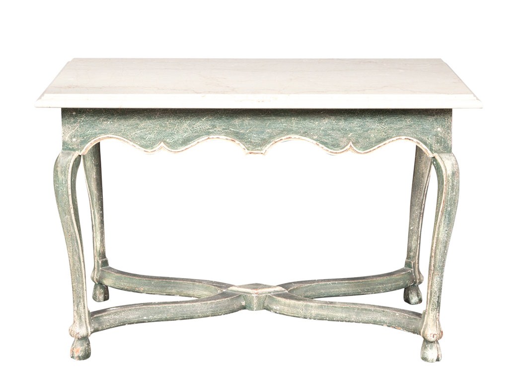
Provincial Style Marble Top Painted Side Table Doyle Auction

Faux Marble Writing Desk- Hideaway Antiques
Swedish Giltwood And Cream Painted Table With Faux Marble Top- Christies

Pair White Granite Urns on Faux Marble Pedestals- Gottlieb Gallery
Italian Neoclassic Faux Marble Scagliola Pedestal- David Neligan Antiques

A Painted Faux Marble Serpentine Bombe Commode From Christies

Italian Painted Console Table- Piet Jonker Architectural Antiques

A Pair Of Painted Wooden Night Stands- Piet Jonker Architectural Antiques

A Pair Of Painted Wooden Night Stands- Piet Jonker Architectural Antiques

Set of Four 18th Century Faux Marble Columns 1st Dibs Paris

Louis XV Painted Console Table With A Faux Marble Top- Wirthmore Antiques

Pair of Faux Marble Painted Columns- LEBRETON INTERIEURS

Modern Louis XVI Style Giltwood Table Painted Faux Marble Top- Seller Glo

A Florentine Gilded Console With Faux Marble Top- Valobra Jewelry & Antiques

Pair Faux Marble Columns- Greenwich Living Antiques & Design Center
 Located 30 miles south of Paris and widely considered one of the most spectacular examples of 18th-century style, the Château du Marais is home to the apartment of designer Juan Pablo Molyneux and his wife, Pilar. The castle was built by the architect Jean-Benoît-Vincent Barré for Master Jean de La Martinière, Treasurer General of Artillery and Engineering, and has been considered one of the most remarkable examples of castle style Louis XVI located near Paris. This castle has been owned by families like Noailles, Castellane, Talleyrand-Perigord and Pourtales.
Additional Links:
New York Social Diary– The Hotel Claude Passart, the 17th century Paris residence of Mr. and Mrs. Juan Pablo Molyneux.


Designer Juan Pablo Molyneux refurbished the 17th-century structure at Château du Marais with rich tones to suit his grand style. An 18th-century gilt-wood chandelier hangs above a Régence bureau plat, a Louis XVI armchair, and a rug from the 19th century; the oil painting is from the 18th century. (Photo Credits- Architectural Digest September 2006)
Check out the beautiful marble walls


A Pair Of Painted Wooden Night Stands- Piet Jonker Architectural Antiques

19th Century Italian Carved Wood Bust On Faux Marble Base. Thomas Jolly Antiques

20th c. French Faux- Marble Column or Pedestal- Olivier Fleury Inc.

Pair of Italian Faux Marble Planters- Dragonette Ltd