
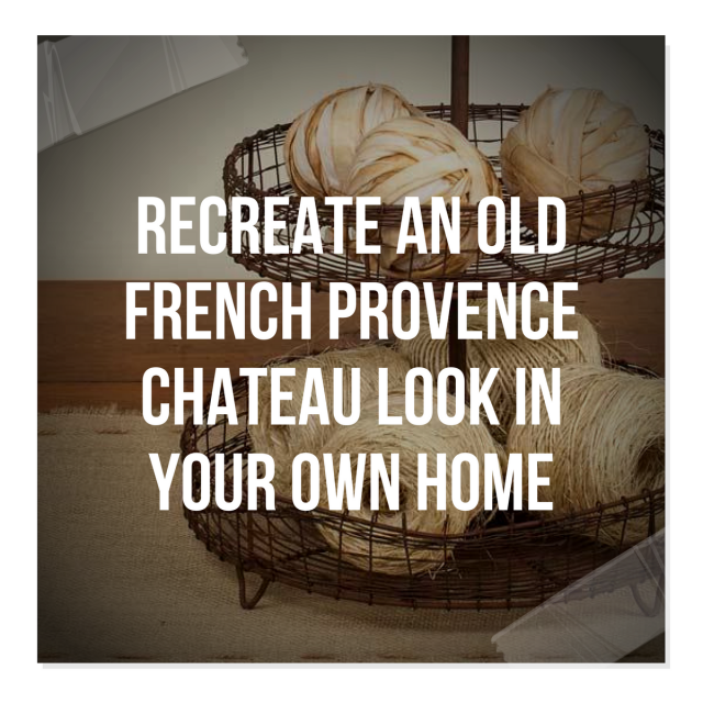
Recreate An Old French Provence Chateau Look In Your Own Home

Aurélien Deleuze and his wife, Pascale, have ren0vated this sensational old world 1700′s chateau that was originally built by an minister who was knighted by Louis XIV. The home sits in the town of Pau, in south of France and has a distinct French country flavor which can be seen in the furniture and the architectural choices.
Whether you are re-decorating with French tastes in mind, or a life-long admirer of the Provence style, this house is certainly one to study.
The couple were not afraid of tackling such a magnificent structure, as they were lovers of architecture and interior design. Their restoration preserved all the beautiful details, and gorgeous antiques and decor were found at the local Parisian flea markets which added to the period touches of the home.
Inside, you will see captivating stucco ceilings, and painted plaster walls that are magnificently detailed. Consider getting the look of their living room by painting your walls a light blue and working with blue and beige furnishings. Demilune tables line the wall in a light painted ivory finish. Linen is casually draped over the sofas with matching throw pillows. The furniture makes this room comfortable, yet functional, and still holds to the aesthetic period style of the home.
In this post below we have collected the very best Linen furniture on Amazon with a French flare. Consider working with all-natural fabrics in your home to achieve that rustic old world charm.
–Linen- Decorating Ideas For Your French Provincial Home
A Swedish secretary in a light blue sits in the corner of the room, and a reclaimed wood coffee table float in between the sofas. Furntiure is distressed and worn showing years of love and use.
In this picture we zoom in on the country French chair with the velvet upholstery sitting along the wall in the Deleuze’s home. In the post we list a chair made from Currey & Company whom sells a terrific reproduction chair almost identical to Deleuze’s chair, listed at 2,138.00. If that is a bit pricey, consider shopping on ebay under “Country French Chair” and comparable chairs will surface for lower price points.
In the picture the chair seems to have a rich velvet cushion which highlights the blue tones in the antique painting on the wall. The bright blue also works nicely picking up the hue of the wall color and the painted secretary in the corner. This painted Louis XV chair has the same rich velvet blue tone seen in the cushions making this fabric a supreme choice for your furnishings. Velvet is usually rich in color and adds vibrant touch to a muted color palette.
The living room is based around blues, and the faux finishes found in their bedroom and bathroom give this home a historical presence. The home retains the original floors, and the over sized kitchen has an impressive fireplace from the 1600s that brings warmth to those cold windy nights. In the dining room, a rustic plank table serves as a long traditional table for friends and family to gather around for traditional French dining.
–GET THE LOOK: Old World Reclaimed Wood Farm Tables For Your
Kitchen
–Reclaimed Distressed Rustic Wood Coffee Tables Fit In Perfectly With This Style
–29 Of The Best Rustic Iron Hardware For Your Provence Chests
See additional photos at Gilles Trillard’s Website , Property’s website: Magie des Lieux. If you like this article, please leave a comment, and pin it on facebook and pinterest, and come again!
How To Recreate A 17th Century French Provence Chateau Look In Your Own Home – Part 2

Aurélien Deleuze and his wife, Pascale’s 17th Century French Country Home

Aurélien Deleuze and his wife, Pascale’s 17th Century French Country Home

Aurélien Deleuze and his wife, Pascale’s 17th Century French Home

How To Recreate A 17th Century French Provence Chateau Look In Your Own Home – Part 2

Here we see a new picture of the hallway from a different angle. Bright yellow has always been a staple color for country French decorating. Look how the trim is painted in a greenish gray tone. White is used on the shutters while the walls feature a deep hue of yellow. Linen drapes hang on the wall, where an antique bench sits with a white cushion.
Borrow some of these Provence elements of this home for yourself.
If you are looking for great set of candlesticks, check out Jack’s Candle Stands from IMAX.
The candlesticks are made of turned aluminum and finished in black sheen. The candlesticks have a wonderful footed design with incredible shape. The set of three feature graduating sizes, and would look terrific paired together for an impacting statement. The dimensions of the candlesticks are 14-20H x 4.75-5.25D and have been discounted to $96 dollars from $175.
Candlesticks sold in sets should always be positioned together for a dramatic statement. Place them on a bed stand ,console table or any where you need a punch of design. Add ornate candle sticks in your home to get that primitive feel amongst your modern conveniences.

Commode – Moissonnier Furniture
Other Provence Decor Considerations:
-Buy this set for only $90 Dollars! 3Pc finial set – stone grey & gold leaf
-Thus Foreside prosecco pitcher, certainly looks Provincial! By Foreside $34
-Make floral arrangements from this lovely set of three round bowl with Feet – Antique Silver Finish $30. Use it as a candy bowl or to dress up your bathroom. Store soaps or face cloths for guests.
-America Retold sells a set of 6 dish with cloche Set For $87
-America Retold sells this trophy centerpiece perfect for the center of the table.
– Decorate with this lovely planter which features and antique style garden chicken wire cloche for $32
-The Apollo pedestal is a great distressed stand perfect for an over-sized urn. Sit it in front of a mirror or a window or at the end of a hallway. This stand sells for $259
-This Lester Iron Glass Bar Cart is the perfect cart to display your dishware that is too nice to sit behind cabinet doors. Stack your white table ware and wine glasses on for the perfect display of all your silver and glass accessories.
-Buy this Copperplated Revere Bowl for a centerpiece for $53.00
-Currey and Company Provencial White 4 Light Chandelier sells for $985 Currey and Company has a number of alternatives in this same style.
-These dentiled Platinum Chargers have a period flare. This set of 4 sells for $23.60. It is easy to collect, when the price point is so affordable!
-This medium metal cloche makes a great decorating piece for a counter or bathroom bookshelf. It is for sale for $30
-This terrific console table has so much potential. It can be painted and distressed to match your interior. It features terrific detail and is one of the nicest demilunes on Amazon. Universal Lighting And Decor sells this table for $329
-Decorate the outside of your home with this painted old fashioned watering can, sold for $53
-Imax sells this set of 5 candle-holders that have great painted patina for just over $100. Imax also sells this set of 5 candle-holder set in rustic wood for $138. Split them up into different rooms of your home.
-Hang this mini pot holder above your kitchen sink. It has a metal finish, which fits perfectly into the Provincial decorating scheme. It is only $20 dollars
-You will adore this lovely set of mini lion bowls. The set of 6 sells for $10.99
-This topiary two tier large planter is a great planter to line up in a row outside your home. This great planter sells for $40 dollars

Rustic Provence Decorating Ideas- Mr Aurélien Deleuze and his wife, Pascale Own This Captivating Chateau in France
In this photograph, you can see a closer look at the Pavé French terra cotta tile floors with a distinct classic Provencal appearance. Pave Tile Blog, located in Massachusetts, were the first to develop old world French and Italian terracotta tile flooring collections from old world designs. It is surprising to know that the natural color of fired terra cottta is not naturally brown. Brown terra cotta tile is usually a result after a treatment of either wax, oil or stain.
They mention that many Americans are very predictable, when they order stone flooring. They often stick to a neutral range of beige, cream and gray colors, while Europeans fully embrace the rich earthy colors.
Why is that?
America is a very young country, and much of our architecture is fairly new. This can be said for most of the country, with exception the east coast where the earliest settled areas have a primitive British colonial heritage with respect to architecture and decorating.
Compare that to Europe. Europe is much older and the architecture can be seen as very colorful and vibrant. I have a passion for Swedish interiors particularly because of the painted finishes. This pinterest board has over 100 pins of different painted buildings featuring the most beautiful period colors. Take for example Switzerland, which borders France is rich in color. In this picture you have roof tops with hues of red, and lovely tones of yellow. In this picture of Austria, you see brighter tones of red, and light power blue in the architecture.
It can be said that when a culture is surrounded by strong colors, they also feel comfortable decorating around those same tones. People who lived in the countryside of France often decorated with the colors they saw in their backyard. Yellow sunflowers, purple Lilac, and the greenery were tones they felt inspired by.
I believe the reason why the western culture chooses more earth tones is the architecture is based around the same color ranges. If you look anywhere in America, the color palette is pretty modern. Concrete roads are gray and beige and architecture is modern rather than antique which you see in Europe. As a person ventures into the country, more painted homes appear in various shades.
See additional photos at Gilles Trillard’s Website , Property’s website: Magie des Lieux. If you like this article, please leave a comment, and pin it on facebook and pinterest, and come again!
How To Recreate A 17th Century French Provence Chateau Look In Your Own Home – Part 3


How To Recreate A 17th Century French Provence Chateau Look In Your Own Home – Part 3

This photo of the Deleuze’s home is one of the most captivating pictures taken of the home.
It seems as this room has several tones of peach and orange which happen to be in the same color family. The soft patina of the fireplace works nicely with the plaster paint tones of the wall and drapery. The grape upholstered chairs add a pop to this interior. A table is positioned in the center of the room with an accent french caned chair.
You can see how this room appears to be soft and the overall effect is much like you would get with gray, but with a slight hue of color! The wood floors pick up the carmel tones of the room quite nicely.
In America we are are used to seeing ceiling and trim colors painted in white, so it is natural for many people to feel as though a painted color on the ceiling might be overbearing, but in fact, if the color is soft, and works within the same hues of the room, it actually produces a dramatic, yet subtle finished effect to the room.
-In this room we see a very rustic interior with several tones in the walls. Colors of gray, beige and white appear in the finish, and if you notice a burnt orange is used on the ceilings. The look is terrific and fits in with a period effect that you would expect out of a 17th or 18th century building.


Aurélien Deleuze and his wife, Pascale’s 17th Century French Home

Aurélien Deleuze and his wife, Pascale’s 17th Century French Home
-Martha’s Dining Room in Bedford features the same color tones as the Deleuze’s home in the above picture, yet instead of the peach tones, she uses the color tones of yellow to complete this look which are accented by her bright silver and glass accessories.
-In this post we feature several well designed rooms by Martha Stewart where in one room the ceiling is painted a light blue and the flooring, walls, trim and dishware on the walls are all within the same hue.
-In this picture by Martha Stewart she features copper tin molds with a coral salmon colored linen table cloth. The walls are painted several shades lighter within the same color family. The trim is painted in an off gray, not white for a period effect. We see the contrast in the green bottle for staging purposes. In real life, green glass would add some shine and contrast against the peach tones.
– This photo from House Beauiful features a wonderful entry way in shades of blue. We see several shades in the wall and trim paint colors. Color is brought in by the lovely display of hats, and the contrasting color tones in the mud boots. The picture frames add a touch of white.
-Create a chair railing by simply using painters tape and several shades of paint. In this photo we see a painted door with an exceptionally pretty choice of pinks. The door and the bottom trim match, while black is used as an accent color splitting the two areas up.
-Likewise in this photo, painters tape can be used to create this look. If you have always dreamed of ceiling to floor framing, this should give you inspiration, as all you need is paint. Use paint colors that are darker or lighter than the ones in the photo, the effect is terrific!
–How about Green? Pair together green and light blue for a terrific contrasting effect. Here we see incredible architectural detail with a painted effect. The result is spectacular!
– Here is a brilliant room painted in a bright green. Pay attention to the the ceiling. The mint green is just as great as white, and blends in nicely into the interior. Lighter shades of the same tones can be just wonderful for a room!
We don’t have to be afraid of color. The photo of the Deleuze’s home shows a room in the lighter Rococo period colors with a pop of brighter color in the upholstery.
Color needs to be executed with precision to get the right tones that give a period effect. Although it doesn’t need to be complicated. The way I determine my color range for a particular room is to start with the prodomenant tones that currently exist in the room. Consider buying a sample of the paint color you wish to put on the walls, but in the darkest hue of the prodoment color in the room. Then use several jars of different amounts of white and black paint to achieve the colors you are most attracted to.
In this series of pictures you can see how white is added to a paint color to get a particular lighter color tone. Purchase a sample size of the paint at your local hardware store, and a small sample size of white and black. The sample size will allow you to paint a few accessories as you decide the color that best works in the room. Paint a slightly darker shade for a vase, urn, candle sticks and so on.
I believe the reason why there is such an excitment for Annie Sloan paint is because her paints seem to be more on the historical side of color tones that have been found in the past.
I believe that the public wants fewer colors that just work well, than 1500 choices of flouresents, and dulled down tones that are hit and miss.
I find so many people confused as they walk into hardware improvement stores looking at paint samples only to second guess themselves when they get home because it doesn’t look right. Paper and Paint also detail historical color tones that have been collected from a company before they closed shop. In this pinterest board, you can see many colors from the years of 1650 and 1850.
See additional photos at Gilles Trillard’s Website , Property’s website: Magie des Lieux. If you like this article, please leave a comment, and pin it on facebook and pinterest, and come again! Don’t forget to follow me on Pinterest and Facebook.

Aurélien Deleuze and his wife, Pascale’s 17th Century French Home

Aurélien Deleuze and his wife, Pascale’s 17th Century French Home