
4 Ways To Get The French Provence Look For Less

French Style Featured On The Essence Of Frenchness
Creating the Provencal country style in your home starts with the right colors, furnishings and decor. Here are some of the main must-haves to create this relaxed, elegant French Country decorating style.
1. Go Bold With The Wall Colors
A home can be instantly transformed with color. A color palette will govern all the other decorating considerations for your home.
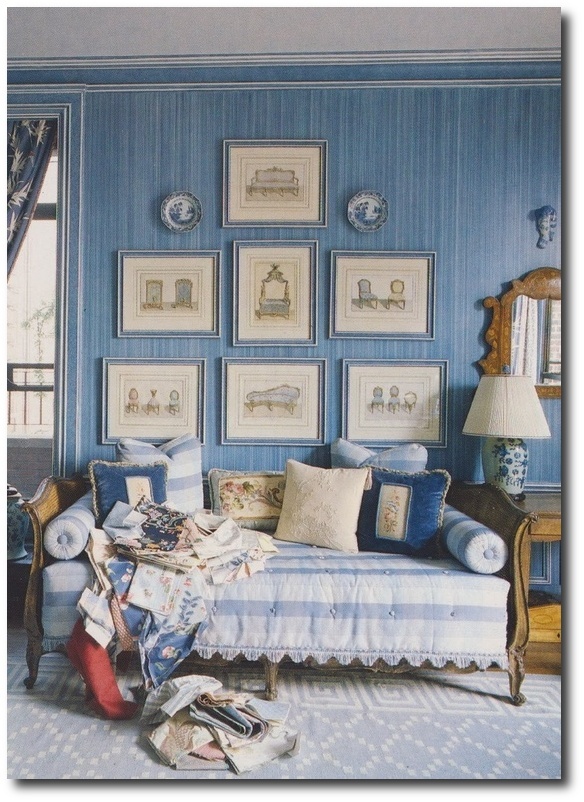
French Provence style has always been known for their vibrant color choices. The color palette has always been governed by the colors found in the flowers and landscape, so it is no wonder why vibrant blues, purples and greens have always been dominant colors in the Provence home.
You may want a muted palette with warm elegant furnishings, such as raw aged wicker, neutral ticking for upholstery, stone and raw wood to take the focal interest. In this instance, consider accenting your home with the richer shades such as browns, found in the soils. Provence style was greatly influenced by the landscape of France, and inviting the colors found in nature into your home will instantly change the tone.
2. Architectural Elements
Consider introducing character into your home with architectural elements. Ditch some of the modern looks in your home with something with age and old looks. Exchange out your kitchen hardware, light switches, chandeliers, lamps, door hardware, sink faucets with older hardware with patina and age. You can find brand new hardware with the old world patina and looks.
– Change out the lighting to a French crystal chandelier. Consider investing the time into installing some antique sconces on the walls in your bathrooms, and bedroom. Light from the wall will give your room the look of candles, than the overhead lighting we are used to.
-Consider hanging iron plaques above your stove. Some of the plaques are quite large, and painted, making it a focal piece behind the stove, which is often hard to dress up.
-Wall Molding doesn’t have to be complicated. Check out this easy DIY wall idea which could totally transform the look of your walls.
Interesting Articles:
-Buying Secondhand Cabinets: Yay or Nay? Cabinet Hardware Ideas
-Handles, Knobs, or Pulls: Which Type of Hardware Is Best for Your Room? Cabinet Hardware Ideas
-Using Cabinet Hardware to Bring Life to a Dull Kitchen or Bathroom – Cabinet Hardware Ideas
-5 Ways to Dress Up Worn-Out Furniture & Cabinetry- Cabinet Hardware Ideas
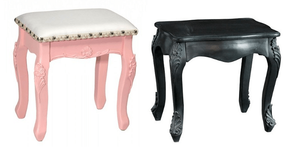
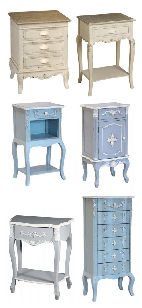
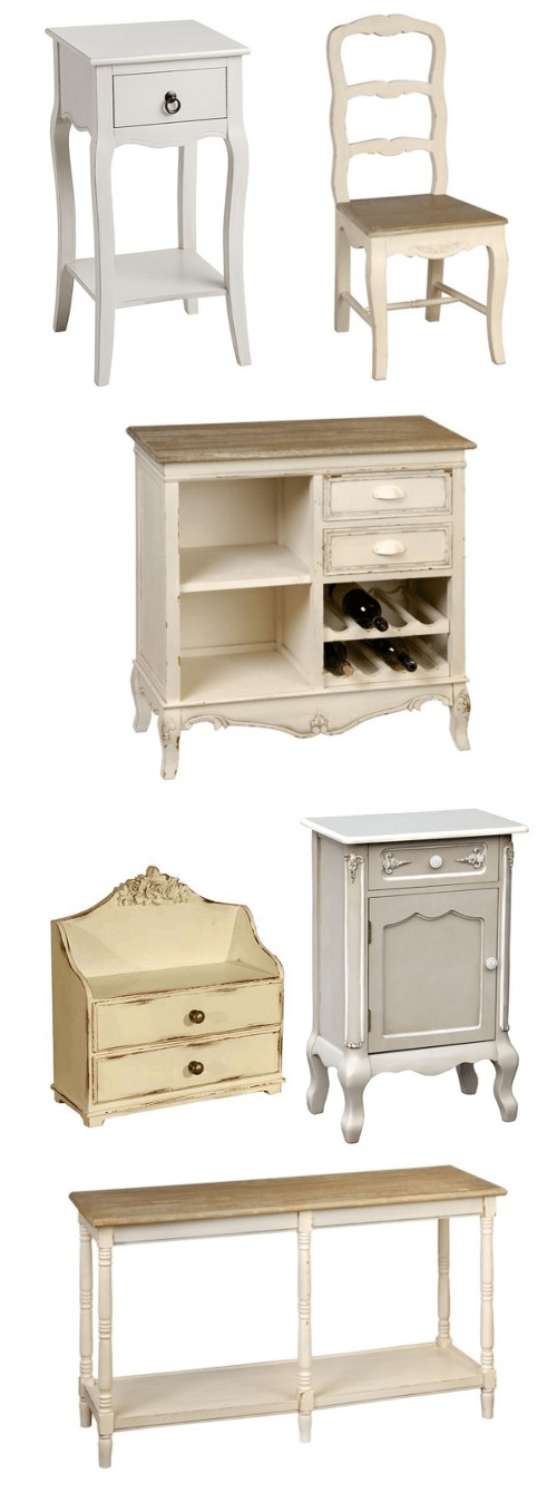
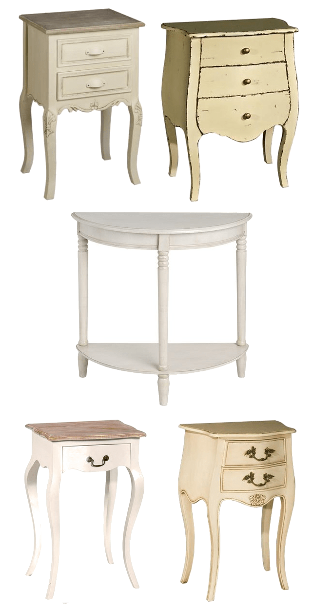
3. Improve Vintage French Furniture
Invest in great pieces, and improve vintage furniture pieces with new upholstery. My motto has always been “trade up”. Fill your home with great inexpensive pieces, and as you find better ones, trade out the inexpensive pieces, with better quality furniture. Your home can look fantastic with second hand furniture. Often times some of the best pieces are the ones that you put some time and effort into. A vintage French chair can be stripped of it’s paint, and re-painted, stained and upholstered. A French sofa can be professionally upholstered and loved for 50 + years. A side table and dresser can be the spotlight in a bedroom, and a small French side table can steal the attention with brighter paint and gold accents. Collect pieces you love, and invest your time in making them better.
4. Go With Solid Pecan Finishes
Balance out brighter wall colors with solid wood stained furniture. You can buy vintage french furniture and strip it down to the solid wood. You can find spectacular pieces on ebay, at garage sales or second hand stores.
One thing I have learned along the years, is stripping furniture paint is well worth the effort. Wood can be painted, and then sanded down to look antique with the solid wood peeking through. Stripping the paint down to the solid wood, also allows you to stain a piece a custom shade. Consider investing in a heat gun. This is one tool, I wish someone told me about years ago. For less than $30 dollars, you can remove paint quicker without shelling out tons of money in stripper. It enables you to use less stripper, remove more paint faster, making removing paint bearable.
Traditional Provence Furniture is usually made of walnut and either left a natural brown and polished to a high sheen, or painted. Pecan stains are found in the most elegant French homes. For an authentic look, consider this stain first before others for that authentic Provence look.


Styled By:Mandy Keener Photographer:Nancy Nolan
At Home in Arkansas featured some beautiful photos of a home decorated around the old world interiors we see in Italy and France. The house itself looks as if it were European, but in fact, this home is right here in the USA! The homeowners wanted something country and rustic, borrowing from the classic looks found in France.
Here are some tips from the article:
“In the bath, we did limestone floors, but in a different way by insetting red Indian onyx. That red shows up in the French gothic revival altar from Avignon, which we used as a vanity. The kitchen island is inset with a single basin, extra-deep, bronze sink.”
The bathroom shows a fabulous cast iron bath with an exterior color matched to the paint on the bathroom walls. ” We wanted it to appear old, as if it needed to be filled with water by hand. And the faucet is in the middle so you can lie on either end of the tub and look out over the balcony. That allowed us to take advantage of the wall space and to approach the bathroom in a different way. If it were my house, I’d enjoy a glass of wine there every evening.”
– Cottage Of The Week in France- Home Bunch

Provence Decorating: HOW TO Decorate With Green
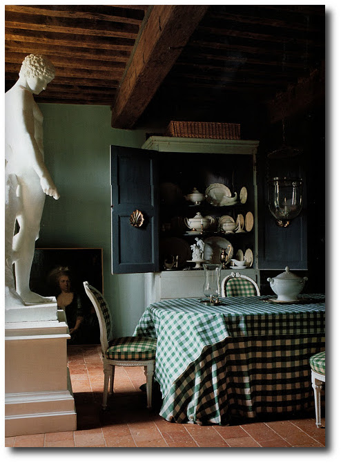
18th Century Manor House – The World of Interiors, Jun 2005-Seen on Genus Loci Blog
The color green is one of the most popular colors to decorate a French home around. A cool green can can create a cool, calm, soothing atmosphere to feel refreshed in, while a darker greens can create warmth and comfort.
1. Mix Your Shades
Pick out your wall colors first, then introduce other shades of green elsewhere. If everything is one hue, it can be a bit drab, consider pairing strong greens with mild ones. Consider brighter colors with darker colors. Dark shades of green look great with punches of lime, or yellow.
2. Bring in Natural Wood
Natural wood and white accents do a good job of balancing brighter shades of green and keep them from becoming overwhelming. To keep the room light and airy, paint ceilings and trim white, or a lighter color tone of your wall color. Adding raw wood, such as a desk, or side chairs can level out the color. Consider adding in painted black accessories or furniture to add contrast. Stainless steel, tile and wood will give your room a balance against pastel colors.
3. Use The Brighter Shades on The Ceiling
Who says the ceiling is off limits? Are lighter colors more you? Making a dramatic statement, by painting the ceiling the vibrant color you want, but feel doesn’t belong on the walls. Consider painting the wall colors a really soft shade of light green that is border line white, and punch up the ceiling with a brighter tone of the same shade.
Color Combinations:
Green + Shades of Purple
Green can blend with a variety of colors and looks wonderful with opposites. Pair green with lighter lilacs, and darker eggplant accents. Shades of mauve, periwinkle, amethyst and lavender-based colors can be paired with lighter shades of green.
Lavender is the color and scent of Provence. The history of lavender stretches back more than 2,000 years. In France, lavender grows in both cultivated fields and wild along the side of the road, so it was no wonder that it became a popular interior color. Chefs have used the flower as a herb in sweet and savory dishes and its nectar to flavor honey, cheese and sugar. Lavender is a light tone of violet. The name comes from the flower of the lavender plant. The color of the flower is still the standard for lavender but there are many other tones of light or medium violet now called lavender also. Their are shades of lavender can range in hue from pinkish purple through violet to blueish-indigo. They can also range from light and pale to medium and greyish shades.
Green + Bright Yellow
Green also pairs well with brighter colors. Think about bright sunshine yellow paired with this gray based green. Green also works well with brown combinations which can bring a sense of coziness and tranquility. Bright yellow actually gives a punch of color in a room based around a gray toned green. Consider adding in black painted furniture with brighter yellow upholstery for contrast.
Green + Kelly Green + Green Blue
Play several like ranged colors together. When combined with vivid jewel tones such as Kelly green, and a green-blue range suggests a tenderness. Light green and sky blue can be enhanced by white for extra freshness.
The trick to green in French interiors is the gray undertones. Whether they are pale or strong, there is always a gray or black in the background. Subtle interiors were a mark of the Provence style interiors.
Colors To Pair With Minty Green
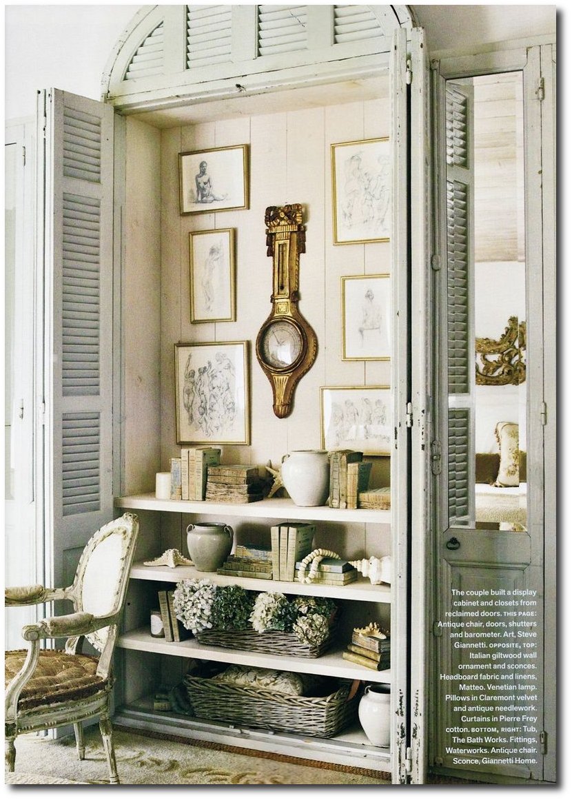
Patina Style by Brooke Giannetti and Steve Giannetti

Painting French Provincial Furniture

French Provincial Painted Furniture- Thistle by Design Facebook
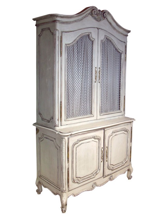
Not surprisingly to its fans, the French provincial-style furniture has become very popular of late, possibly as a reaction to the aggressively modern style that has dominated previously. Interior designer Bernadette Ferrari says she believes it will continue to be a popular trend as it combines elegance with functionality, according to FerrariInteriors.com.au.
This style of furniture is beautiful to look at without having to change anything at all, but it can become dingy over time, due to its inherent natural appearance. The French are well-known for their proclivity to paint furniture. Most often, this style uses white paint, which provides a fresh new look for outdated furniture, although other colors can be used. Painting is a great way to transform a piece of old furniture into something new with minimal expense.
You can add even more interest to almost any piece by using mouldings, painting details in another color, or adding gilt on the trims, as LilyFieldLife.com suggests.
While you could pay someone to paint your furniture for you, it’s a lot more fun to do it yourself. Save your money, and find a contractor to help in other aspects of a total room or home interior makeover.
Enjoy the opportunity to get creative by following these steps (with help from LilyFieldLife.com) toward painting your own French provincial-style furniture.
Cleaning
Before you begin, cover your work area with old white sheets or newspapers. Even the most meticulous painters make mistakes now and again. Next, clean the item you want to paint by wiping it down with a dusting brush or a moist cloth. Remove all of the dust, as painting over dust doesn’t mend well. As most French provincial style furniture is made of wood, you shouldn’t get it too wet, as this will cause the fibers of the wood to swell.
Unless you want to paint the hardware, removing it will make painting easier.
Sanding
If you find any cracks or holes in the piece while cleaning, use wood filler to fill them, and then sand to a smooth surface. Next, you should sand the piece all over very lightly. Be gentle, and remember– this type of furniture can be quite delicate. If it’s in generally good condition, you don’t need to completely remove the old finish. Rough it up just slightly to give the paint something to adhere to, and sand in the direction of the wood grain in order to avoid any noticeable swirl marks.
As many pieces of French provincial furniture have melamine tops, you can also sand this with a relatively fine sander, and apply a coat of flat white oil paint. As it is quite durable and has a flat sheen, this acts as a primer, according to Natty By Design.
Priming
You’ll need to prime the entire piece. This is especially important with old wooden furniture, as it can bleed through the paint. If this occurs, use two coats of primer and that will usually correct the issue. If you decide to go with a darker color, use a tinted primer.
Painting
Painting the piece can be accomplished using a spray, brush or a roller. A good quality paint brush generally creates the best look. Turn the item upside down, and paint hard-to-reach areas first, keeping an eye out for any drips or runs. These can be corrected by feathering your paint brush across them before they dry. They can be avoided by not putting too much paint on your brush.
You’ll need at least two coats of paint. Wait at least one day in-between them, or longer if possible. It needs to dry completely before painting the next coat. If you live in a humid location, it may take longer to dry.
Protection
A top coat should also be applied, especially if you’ve used acrylic paint. Polyurethane, sealers or furniture wax will work, although oil-based poly or sealer should not be used over white paint, as it will cause it to well.
Finally, you’ll need to wait at least three days, and preferably five, before placing any objects on your beautiful and newly painted piece of furniture in order to avoid scuffing.
Guest Post By George Iverson- George manages his own interior design company and website about home building and decorating.

Italian Side Tables – Interiorflair on ebay
French Painted Cabinet Jansen Greenwich Living
 Stoneware Studios produce in Ireland a range of Natural Limewashes and Traditional Paints for historic buildings. We are also the national distributor for the highly acclaimed Earthborn range of paints and decoration products.
Earthborn is a range of eco paints and natural varnishes designed to provide a healthier and environmentally friendly alternative to conventional paints and varnishes. Whether you are looking for VOC free paint, organic paint and varnish, water-based paint, water-based varnish or high performance paints and varnishes, Earthborn Paints has the product you require in its portfolio of natural and eco friendly paints and varnishes.

Chateau de la Goujeonnerie
18th Century Painted Louis XV Buffet Petricia Thompson Antiques
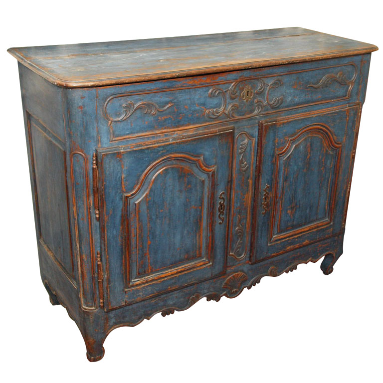
 Distressed Blue Painted French Blue Cabinet With Chicken Wire
 Cream Painted Armoire- Unknown Credit
 Designer Rachel Ashwell


Art dealer Guy Morrison and Penny Morrison Wales Home.
 Painted Hutch Featured in French Country Living by Caroline Clifton-Mogg
Italian / French Side Table – Interiorflair on ebay
 White Painted Furniture tolix chairs, Swedish Wood Country Chair
 Lisa Fine Textiles

Furniture restoration expert Carolyn Pickell has refurbished most of the furniture in her store Side Furniture on San Pablo Avenue including; the french chair with vintage upholstery that she painted pink, Photo: Kat Wade Read more
 Romance With Flowers- See This Whole Store Here.
 Pink Farmtable- Faded Plains Blog

 Worcestershire Barn Conversion- House To Home Magazine
Borrow this beautiful color for your provence furniture


Italian Side Tables – Interiorflair on ebay

All Dolled Up – Reclaimed Furniture By Hand
 All Dolled Up – Reclaimed Furniture By Hand
 All Dolled Up – Reclaimed Furniture By Hand
 JoAnn Barwick’s Blue and White Home Florida- Freshome
 JoAnn Barwick’s Blue and White Home Florida- Freshome
 JoAnn Barwick’s Blue and White Swedish Home Florida- Freshome
French Furniture – Interiorflair on ebay
French & Italian Side Tables – Interiorflair on ebay

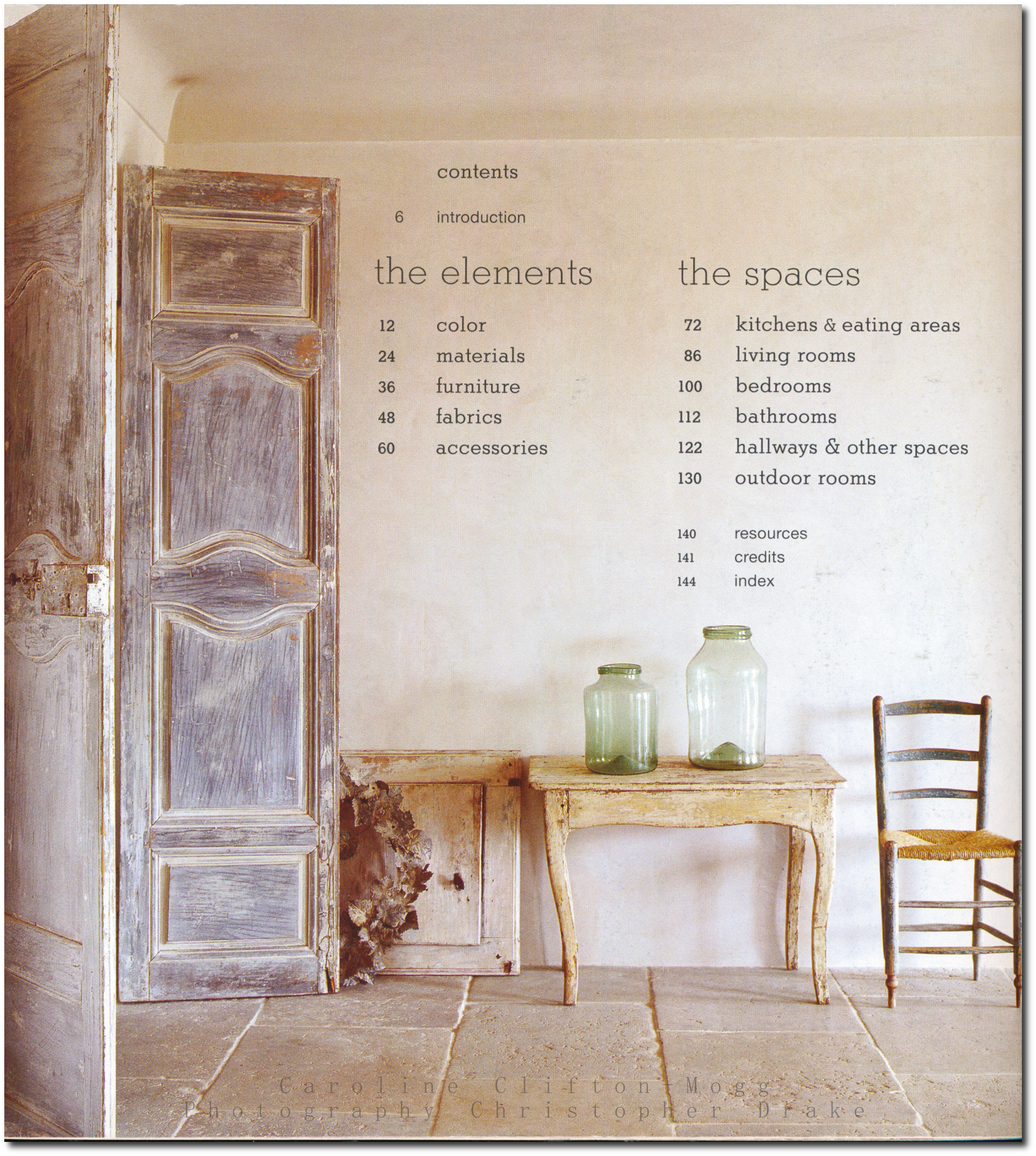
Book Review: French Country Living By Caroline Clifton Mogg
 With the pricy cost of books these days, often times, I like to try them out at my library before buying them. If they are great, I tend to write up a post, because an exceptional book needs to be known. This is a book worth buying! I tend to enjoy the books that reveal more of the historical properties, because they provide a unique and fresh approach to decorating. After looking at thousands of pictures for our many blogs, there are a few books in my library that I can look at over and over again, and they never become dull. This is one of those books. With close to 5 stars on Amazon, selling new for $32, and used from $8, this book can be a classic in your library.
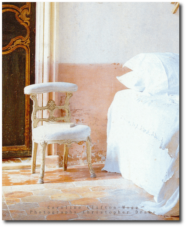
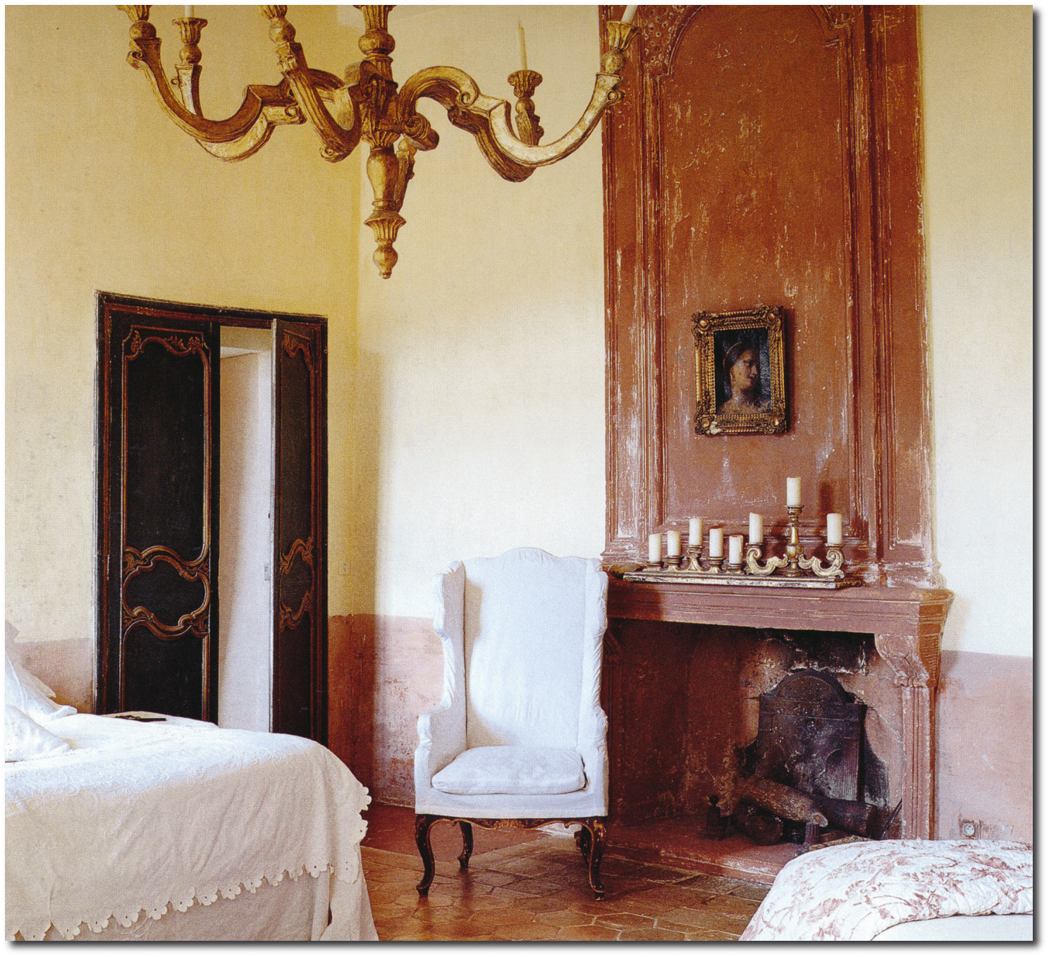
There is a great beauty of discovering the old, the worn, something loved for years, and passed down through families. Caroline Clifton Mogg writes a number of chapters, on the elements which make a home.
Page 12- Color, Page 24 Materials, Page 36 Furniture, Page 48 Fabrics, Page 60 Accessories, Page 72 Kitchen and Eating Areas, Page 86 Living Rooms, Page 100 Bedrooms, Page 112 Bathrooms, Page 122 Hallways & Other Spaces, Page 130 Outdoor Rooms
In this book, 140 pages covers 307 color photographs that illustrate the beauty of the French countryside. City decorating is quite different from French country decorating for the most part. The country approch is rustic, rough in some situations, and a bit more relaxed.
One review left this comment:
“If you are afraid of color, this book is for you. Don’t let it convince you, though, that french country is not about bold colors- every other book I’ve seen says the opposite. That said, it is a beatiful book, with lots of rustic elements.”
If you are looking for the saturated colorful interiors like this, this or this, this book covers more of the muted styles. Intead of rich saturated colors, it works with colors that are muted. This book certainly presents an elegant approch to the French countryside home, rather than the folk country looks with rich vibrant colors. Certainly many of these looks that the author presents can be used in the city as well as the country.
Pictures from the book featured on Blogs
– Trouvais Blog features page 57, 13, 122
-Painted Furniture – Page 46
-Brooke Giannetti- Page 14, 50, 102, 110, 12, 18, 96, 40, 49, 27
– Aged and Gilded Blog, Page 139, 138, 76
– Paris Apartment- Page 85,
-Zsa Zsa Bellagio Blog- Page 97
Here are a couple more pictures that I cannot locate in the book:
– Spectacular French Doors, here
-A Buttercup Yellow Wall Cabinet – here
Quotes From The Book:
“From gray also come mauve and lilac—either as bright as the color of violets or or closet to the quiet, almost musty tones that are quintessential French, and which look so winning when teamed with gray green, perhaps used on woodwork. A more sophisticated combination that is sometimes seen is a gray mauve offset by a dark, almost terra-cotta red—the red known as sang de boeuf makes a particularly effective contrast. Pinks and peaches are also to be found among the range of
French country colors, but they are not childlike nursery tones—there is nothing of a sugary or sweet nature about them. Like so many French country colors, the pinks and peaches appear
almost organic, seeming as though they might have emerged from the color of the original plaster than applied on top of it, and again, they often seem to include a hint of pale ancestry”
“A wide variety of woods is evident in rural interiors,but the woods used in different parts of France
were and are largely those from the trees growing in the surrounding countryside—fruit woods such as walnut and cherry, and traditional hardwoods such as oak and elm. Exotics such as mahogany or
maple will not be found in abundance here, for self-sufficiency is the name of the game”
Reviews:
By “Caroline Clifton-Mogg’s French Country Living is a delicious book to look at; the pages are filled with beautiful, airy rooms and the accompanying text does a good job of explaining how the effect is achieved–lots of grey in the colors, painted furniture, small-sized fabric prints, etc.
By Hollygolightly- “This is French country living in the Marie-Antoinette-at-Petit-Trianon style, not truly rural la France profonde, however. The exquisitely restored rooms are filled with priceless antiques, and a cursory glance over the photo credits suggests that the majority of houses shown are located in either Provence, or the richer departements near Paris (the most famous house in Yvelines is Versailles, if that gives you an idea of what’s in the neighborhood of some of the chateaux photographed). Having seen more than one room in a rural French house with vinyl wallpaper on the ceiling and door, I can only wish that all of French country life was this beautiful! ”
By John Matlock -“In this book, hundreds of color photographs by Christopher Drake, illustrate the essence of the French countryside. The book is in two parts, the first emphasizes the soft, non-contrasting colors and the natural materials and textures that are distinctly France. The second part of the book looks at the overall style. It looks at the French home, starting of course with the kitchen (this is after all France). Only then does it move on to the rest of the house, ending with the French garden. And this is France, so the garden also emphasises a place to eat and drink.”
By Julie BarrettZiegler- Fantastic photography, and a generous, diverse selection of beautiful interiors. From iconic over-the-top French decorating, to simple Provençal country style, this book celebrates the special environments for real living evoked by good French decorating style.
By D Thoden- I got this book as a Christmas present 3 yrs ago, and it is still one of the best decorating books I have ever owned. If you like whites, creams and soft, grayish colors, along with authentic chippy antiques shown in lovely old homes, you should love this book. It’s not LOOK AT ME decorating. It’s used, comfy, old furniture and fabrics, and it’s divine. This book ultimately changed the look of my home. The holidays were especially rough that year; I missed my Mother and was sick while at my in-laws over the holidays. This book got me thru it all!!! I just laid in bed and read it and looked at the photos over and over.
By Gerard Brady -Love this book. I have all kind of pages marked for ideas. Beautiful pictures, descriptions. The book is in great shape as advertised. It will become one of my “go to” books for decorating. Love it!
By Savannah, GA USA- By I love this book for ideas and inspiration. My favorite part of France is the Loire Valley and Sologne. The pictures in this book show that classic casual style. I also love Paris, but the Parisian style is more formal and ornate. I like the brick and terra cotta floors, the wood furniture, the lavender and sunflowers of the countryside. This will take you beyond chicken figurines and calico prints! Great read, great price. Great book for daydreaming! Enjoy!I have also bought Italian Country Living by the same author. Another wonderful book.
By T. Brashear “Dessa”- Sumptuous photos of sumptuous French provincial houses, with helpful guidelines about what characterizes French country decors (though I agree with one reviewer that not too many French country houses look like this). I particularly like the author’s emphasis on how livable the style is, and find this to be true too. Buyer beware however that French country may look a lot different in an American ranch house: a lot of the charm comes from plastered stone walls, old beams and well-worn tile floors.
By Stacey M Smith- Beautiful book. Inspiring photographs that capture French country style (obviously, note the title). My only complaint about Clifton-Mogg books is that the photos are recycled. I see the same photos is many other books. There are MANY wonderful estates, villas, and country properties out there – – – it would be nice to see more of them instead of these multi-used images. The “recycles photos” are no problem if you just have one of her books – – but if you buy many European decorating books, you may see repeat photos.
Striking distressed doors with a neutral background
One common paint technique we don’t see today is the bottom half of a wall painted in a different color. Perhaps this was done to clone the look of wood architectural wainscoting?
It certainly looks amazing, and a look that can add a bit of color into a room,without having to paint an entire wall.
Look how the pale pink on the walls picks up the beauty of the tile. Spectacular!
This is the other part of this amazing room

Tremolet’s Chateau d’Ailly in Normandy

Gerard Tremolet worked in the fashion world most of his life, but after leaving the industry of fashion, he pursued his own interests in interior design. Back in 2007 he and his partner purchased the Chateau d’Ailly in Normandy and renovated it to transform it into a bed and breakfast. To decorate the castle Gerard Tremolet drew his inspiration from his love of the 18th century, adding his own personal touches along the way. While the colors aren’t historically accurate, Tremolet shows us that bright, bold color can be used in period styled homes and furniture.
Saturated dark red walls in the dining area are paired with a beautiful collection of natural vintage styled baskets and blue-gray provence chairs for a nice contrast. The combination of the damask wall fabrics, striped velvet fabrics, and iranian patterns show us that even complex color combinations can work together. Colors such as yellow, turquoise, hot pink and lime are some of the colors used throughout the Chateau d’Ailly. French XV, XVI furniture, and Italian Venetian furniture and accessories are paired together giving off a look that is carefully collected and adored. A modern styled “Renaissance-style ” approach is used through the home, and can be seen in the guest bedroom. One the best rooms is shown below. The walls and curtains are of a Thevenon toile de Jouy. A Louis XV armchair sits in the bedroom and can one of the best examples of French style in the home.
To read the full article head over to Elle Decor.


3 Ways To Borrow Pam Pierce’s Slipcover Looks For Your Provence Home

Pam Pierce has single-handedly brought back the popularity of slipcovers, as her interiors bring forth the charm of the old world European interiors to center stage once again. Slipcovers have always played a key role in her interior designs. Linen ruffles and gatherings in dark olive, and oatmeal are paired with stone floors, re-claimed wood tables, white washed wood furniture, and time aged painted decor. Pierce tends to use natural materials like stucco, limestone, reclaimed beams, and sea-grass to create a sense of warmth and history. Her designs also incorporate architectural salvage such as reclaimed antique doors, and iron to create an aged European feel.
Decorators and homeowners have realized the possibilities that slipcovers offer a home. Slip-covers are not only decorative, but practical. At one time, slipcovers served the means of protecting upholstered furniture from the dust of summer months, although they have evolved over the years, from just large sheets which covered furniture, to be tailored to fit the shape of sofas and chairs, even having decorative pleating, ruffles and embroidery.
3 Ways To Borrow Pam Pierce’s Slipcover Looks:
1. Use The Same Material On All Of Your Furniture
Get the look of a set for less, by slip-covering all of your furniture in the room with the same material. Unite several pieces of furniture out of the same bolt of material. Buying matching sets of vintage or antique furniture can be rare and costly. Create the look of a set by using the same material on all the pieces. Create drapery out of the same material to unite the room. Several ebay sellers offer bolts of fabric, which can be shipped to your home without having to drive from store to store.
2. Choose Natural Fabrics
Heavy linen, and cotton canvas have been popular as natural slipcover choices. French tickings can give a natural look, while at the same time, isn’t plain to look at. Consider using unbleached muslin, which can be dyed in soft shades of blue, green, or yellow. Gingham, simple checks and stripes lend a sophisticated touch to a Provence styled home. Stripes, patterns, florals hide dirt well, and are easier to launder. Checks, stripes and florals work hand in hand. Consider using 2 or three fabrics together in a room to create interest.
3. Go The Extra Mile With Detailed Slipcovers
Gathers, and wide flat box-pleats add interest to the bottom of slipcovers. These details can be used just below the seat of the chair, on a line with the seat frame. This style works particularly well with French chairs, as the legs themselves are decorative in themselves that they do not need to be concealed. Consider pairing down the accessories and furniture in your room, and opt for longer gathers, which puddle on the floor. Work this idea in larger rooms, where the furniture itself is the main focal point.
Additional Links:
– Drop Cloth Slip Cover Tutorial-beneathmyheart.net
-How To Make A Club Chair Slipcover- lisaroy.ca
-DIY Ottoman Slip Cover-dittledattle.blogspot.com
-How To Sew Double Cord Welting –littlegreennotebook.blogspot.com
-Upholstery Adhesive – Beacon Magna-Tac 809 –littlegreennotebook.blogspot.com
-How to Make a Sofa Slipcover- makethingsforhome.blogspot.com
-How To Bleach Drop Cloth- myjoyinthejourney.blogspot.com
-Slip Cover Tutorial – 6 Part Video Series- missmustardseed.com
-How To Make A Chair Slipcover- honeybearlane.com
-Wing Back Slipcover- thebrickpathstudio.blogspot.com


