French Designer Jane Moore Gives Her Top 3 Tips She Designs Around
Veranda had an article asking European Designer Jane Moore her top tips for design. Here is what she said:
1. Tip From Jane Moore – The OPPOSITE EFFECT
Let your environment help you make decisions about your interior design.
” I have always lived in Houston, where it is very hot and humid. As a result, I always pick cool colors that come from nature—soft blues, greens, grays—because when I come in out of the heat, I want to be refreshed. ”
Why this design advice works is your outside environment plays a very major role in your life. If your missing the elements from the outside that you crave, bring them into the house which you spend the rest of your time. If you live in a cold climate, warmer accessories might be something to invest in. Perhaps velvet pillows in deep shades of rust instead of blue and green.
What do you think? Great tip?
2. Tip From Jane Moore – EDIT
As you mature in your life and design, edit to what you love the most, and remove the rest.
It can be hard to give up something that you spent a lot of money on earlier in your life, or a piece that is hard to find. As you get older, you find that the pieces that really don’t match your style can drag down the appearance of your home. The clutter shines a spotlight on things you don’t even like anymore.
Take a good hard look at the pieces you own. Showcase the nicest pieces in your home, and you will find your eyes are always drawn to them, than the pieces that you keep saying… “I need to get rid of that”.
“I started my career doing almost all English, but as I grew to love the Provençal and Swedish aesthetics, I let go of those English things, even though I still loved them.
“The same goes for people with a lot of bright, colorful pieces who want to transition to something serene and neutral.”
3. Tip From Jane Moore – FOR YOU ONLY
Buy For Yourself And Not For Someone Else.
Live in your moment, not in someone else’s.
“Those before us—grandmothers, mothers, friends—had their time to enjoy what they loved, but that doesn’t necessarily mean we have to love it, too.”
‘Oh, someday my daughter will love it, or my granddaughter will love it,’ Then I thought, ‘No. I love it, and if they choose not to have it in their homes someday, that’s all right.’
This happens all the time. You pick up something for someone else, and you think they will love it, but they never really do. It becomes wasted money, but your feelings get hurt in the process. Let other people hunt down their own treasures, as in the end, often times its the hunt that is thrilling. Even if you exactly match what they are after, most people don’t pull the plug on those finds, and you end up wasting your time and energy.
4. Tip From Jane Moore – INVEST
Save Your Money For What You Really Like
” Avoid buying what I call ‘fillers.’ Instead, buy only what you absolutely love, what you simply cannot live without. ”
Isn’t this true for buying in general? We tend to come across something locally, and we just purchase it, even though it’s not exactly what we are after. Instead, put the items that really match your vision in your online cart, or hold back until you find exactly what you are after. Highly edited interiors show a distinct style. When you look at the piece, and your not really sold out for it, eventually it will be discarded after you get tired of it anyhow.

Book Review: Provencal Interiors By Betty Lou Phillips
If you are thinking about redecorating one room, or refreshing your entire home, and are looking for a more of a french provencial feel, Provencal Interiors: French Country Style in America may be the book for you.
New, this book cost close to $40 dollars, but you can get it from Amazon used from a staggering $1.50. With 18 reviews of this book, most site the book as very helpful for building ideas for their upcoming french provincial decorating projects.
While a few claim the book is far off base from genuine Provencal interiors, the pictures are stunning and quite inspiring. The negitive reviews come from overly critical obvious designers which claim that the genuine interiors of Provence are NOT made up of wealthy and purposefully decorated rooms.
What I find refreshing about this book is the author guides the reader to find their own style; being either being formal or country, she provides the overall building blocks to french style. For the vast majority of Americans, most are interested in the high end styles, than the peasant country interiors, this book applies to the majority of the public.
Phillips provides a range of inspiring pictures from both formal and informal. The book consists of 144 pages and even goes to the trouble of adding a lengthy 204 contact list of designers who specifically sell French furnishings in the USA.
A review from Paul Johnson says it has been helpful for him while he was in the process of building a French Chateaux house. The pictures in Phillips book allowed him to gain valuable insight for his decisions with colors, fabrics, moldings, furnishings, trim, cabinetry, and paint colors which he was able to present to his builder.
Provencal Interiors: French Country Style in America does give you great example of color schemes and architectural design which works together to create an overall great design. The contents of the book are broken up into 12 sections.
The first and section section reviews color choices, scale, texture, with many inviting and vivid photos. Section 3 talks about essentials in making a grand statement in a home. I particularly enjoyed her review of plaster walls on page 33 which can essentially transform a room all on its own. Brick, plasters faux finishes, old plank floors, glazed walls, and the charm of old craftsmanship can go a far way in designing a french inspired room. Section 5 – 8 reviews in depth the ideals of furnishings and textile choices, to bedroom and bathrooms.
Phillips tells us there is no right or wrong way to decorate when approaching the french style. Humble or grand, interiors are unpredictable and highly individual. The spaces photographed in her book have a strong sense of beauty, but all classify as well- designed. On page 44 Phillips suggests to buy the best you can afford, which I couldn’t agree with more.
Phillip states ” don’t forget about the well made, well-worn second hand reproductions that are superior to what you could purchase new, or vintage pieces that would look better painted”
Many of us, including myself cannot afford genuine french Provencal furniture, so I opt for the reproductions which are affordable in my price range. I collect them over time, and with the availability of paint and upholstery, it saves me thousands, and I can still attain the professional interiors featured in her book. Collecting over time makes it affordable, and allows you to switch out your furniture for better quality as they years go by.
She begins by saying that a well planned room that is prioritized is essential. If the plumbing and electrical are all in place, the furnishings, fabric and paint would be the prime considerations for a room. Often times if existing furniture will work in a room, a new mirror, rug, or collectibles could alter a rooms character. It is important that editing a few objects and focusing on the necessities that have special meaning can start the rebuilding process.
Color is one of the most powerful elements in design, and when used in the right way, it can raise ceilings, lengthen walls, draw your eye to architectural details, and hide flaws. Color can influence the atmosphere from a feeling of rest to refreshment. Not everyone feels confident when working with color, especially when there are such a wide variety of choices to select. Many people take rest in neutrals while wanting to venture into color, but just don’t know how to properly execute it.
Phillips suggests the first step to take is to identify the colors which are attractive to you or the client. This is relatively easy to begin with. Another starting point is to start around a favorite piece of furniture, such as a painted chest, or art work and work from the standpoint of picking complementary colors and additional furniture centered around one favorite focal point.
A general rule of thumb is to keep a color scheme to 3 colors and no more than 4 which unite the elements. It is not necessarily to stick to the same three colors through out the home, but if a complementary color can be determined which links one room to another, an overall flow can unite them together.
A color wheel has been every decorators best secret, as it is a tool that can combine different color combinations for the best impact. The color wheel is broken down into categories (monochromatic, analogous,triadic, and complementary) which can give a designer or homeowner an overall sense of direction.
Some tips from Betty Lou Phillips:
– Take advantage of what is already in your home such as baskets and greenery which most people own which has a french feel. Consider existing fabrics that suggest a European influence. Painting existing furniture can be a way of making a new statement.
– Arrange a similar mix of objects on a commode or dresser. Arrange an uneven mix of groupings, such as three plates on stands, a stack of three old wooden boxes together which make a bigger impact than 2 or 4. Consider grouping things together than staggering them around the room.
– Edit your belongings. Having too much clutter will only subtract from a well designed room.
– Improve a chest with some paint. The antique white, gray, green and soft aquamarine blue painted furniture.
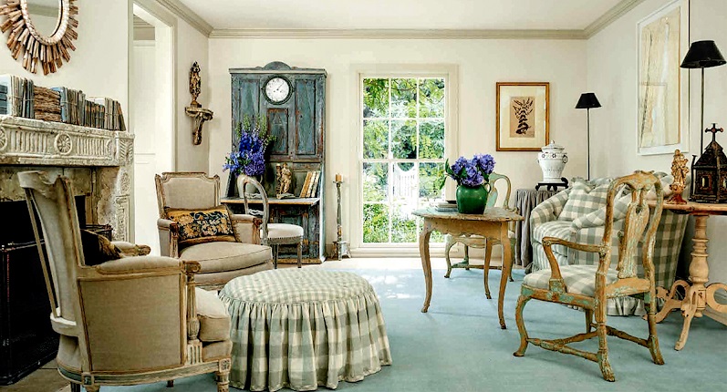
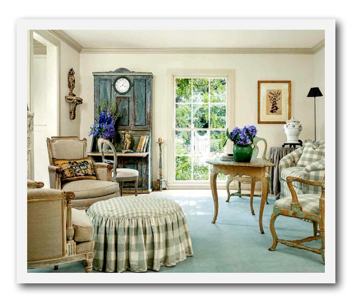
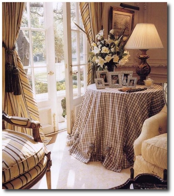
– Consider fabrics as the second most essential ingredient to a French Provencal room next to having french furniture. Layering rooms with french fabrics, specifically florals, stripes, and checks which all work together. Gingham checks, and florals often balance each other out.
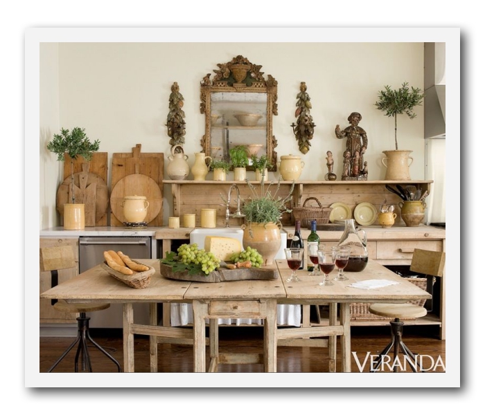
– While Americans tend to hide their clutter in the pantry, in France, wire baskets were used to store eggs, breads and utensils. Old heavy copper pots, bowls and tin molds are very common in french styled homes.
– Fine damask table cloths, and linen are draped over tables. Mixing patterns is common in french interiors. Over-sized wine glasses are not reserved for special occasions, but used even for table water.
-Seagrass, and jute throw rugs loosen up formal looking sitting rooms making them less stuffy and more inviting and comfortable. While some prefer bare wood floors, others like the ornate appeal of oriental rugs.
-Slipcovers can be one of the most useful ways to clean furniture especially with a growing family. They protect luxurious fabrics, but can also be an inexpensive way of improving a french chair bought second hand. Upholstery takes time and energy, and slipcovers can be a quick update instead of the expense of upholstering.
-When it comes to upholstery, nail heads can sharpen up a piece of furniture giving it more richness and elegance. French are quick to note that Americans often space their nail heads too far apart, throwing the most perfect chair’s proportions out of balance.
– Common french elements are framed family portraits, stunning flower arrangements,memory photos in frames, well read antique books, framed old maps, decorative throw pillows, reading lights, warm throws,alcohol decanters, tole lamps, tole trays, and transferware hung on the wall.
We hope that Provencial Interiors By Betty Lou Phillips will be as inspiring as it was for me.