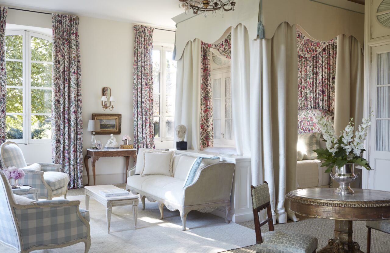
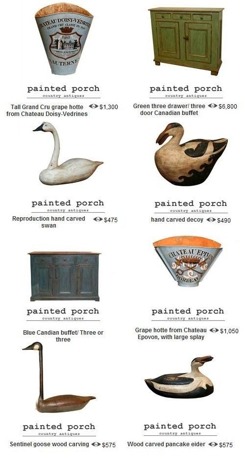
Le Mas des Poiriers, – An 18th-Century Rhône Valley Farmhouse
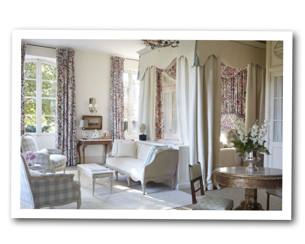
After nearly a decade of blogging about beautiful homes, one in particular has captured my heart like none other… Le Mas des Poiriers, an 18th-century Rhône valley farmhouse. I dream of visiting one day, and I was delighted to receive a copy of Provence Style: Decorating with French Country Flair, written by homeowner Shauna Varvel with Alexandra Black, and released this month by Vendome!
Named for the working pear orchard on the grounds, the property was reimagined by noted local architect, Alexandre Lafourcade, who transformed a rough structure into a luxurious expression of the Provençal aesthetic, referencing historical influences, rural traditions, and Parisian taste.
Read more at theglampad.com
My Modern Take on Traditional Provence Interiors
By
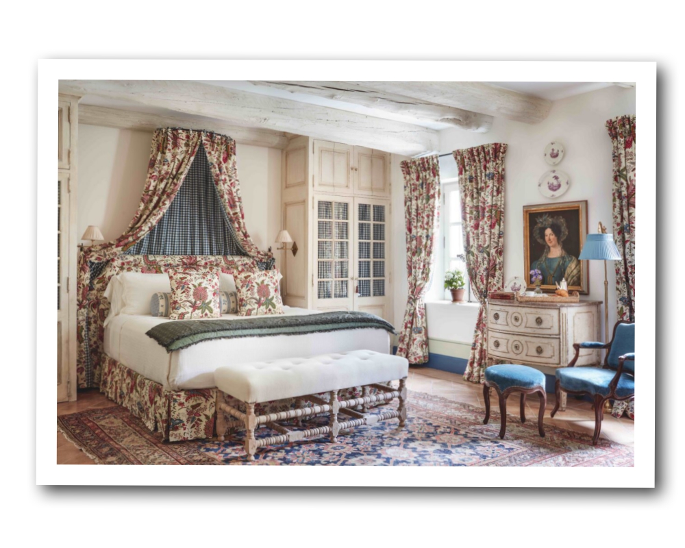
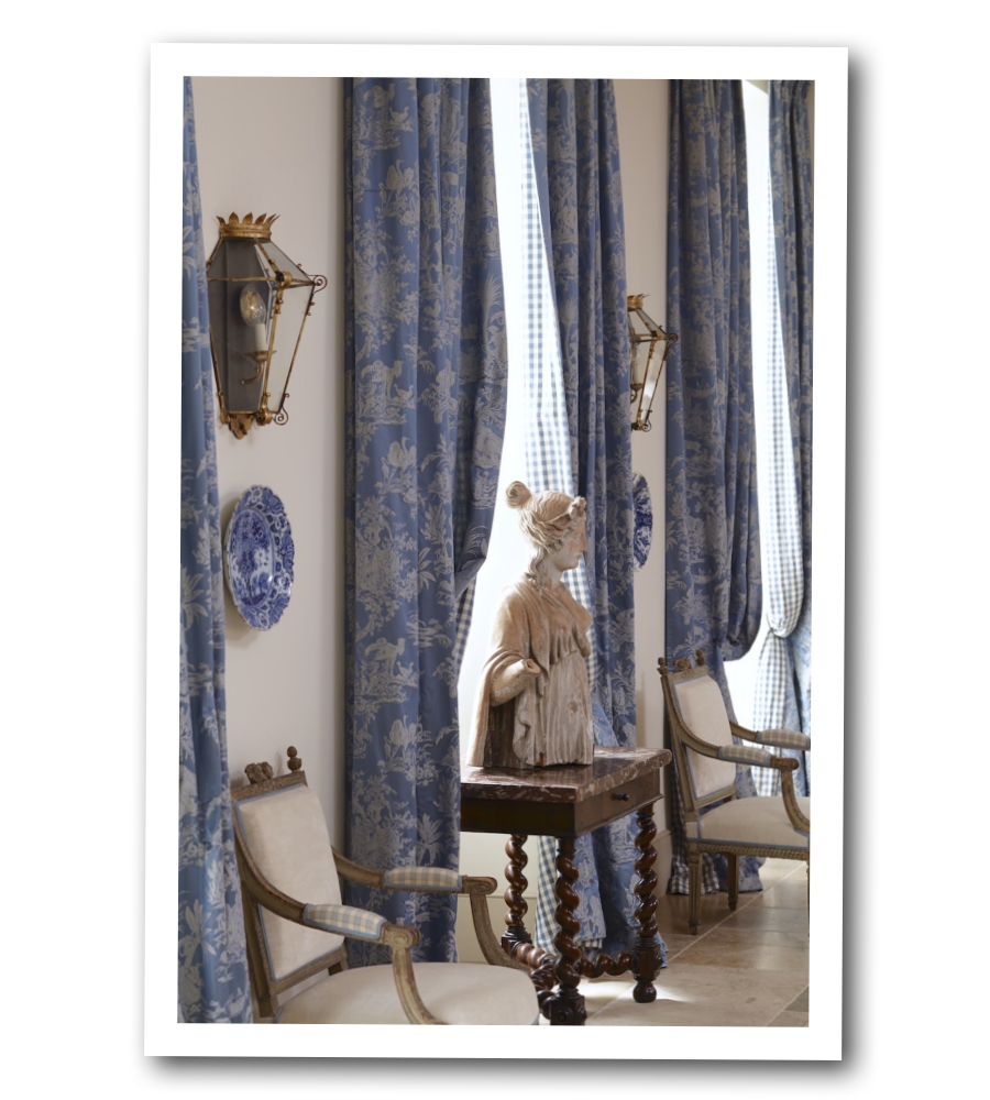
Working closely with Shauna and Alexandre Lafourcade, the acclaimed French renovation specialist, I felt pressure as an American interior designer to bring the right balance and authenticity to the spaces. I admire so many things about French interiors. For me, the Mas had to be elegant without being stuffy, romantic without being frilly, and comfortable without sacrificing style. Here’s how I chose to salute French Provençal decoration at Le Mas des Poiriers:
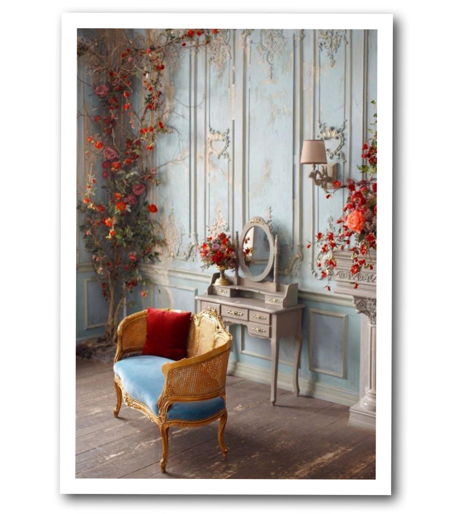
Gingham and Florals
The use of gingham, or “Vichy,” fabric dates back to the seventeenth century where it appeared in Provence interiors. I paired elegant florals and Toile patterns (which originated in France) with simple gingham in the interiors of the house. My favorite combination is in the Dining Room where I blended both fabrics on the South facade overlooking the gardens. I intentionally used blue and cream on this elevation to create a calming and cohesive elegance.
Read more at sblonginteriors.com
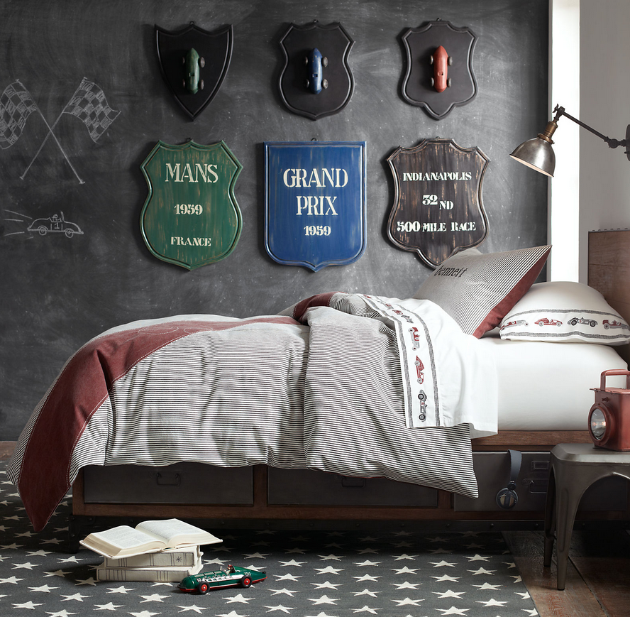
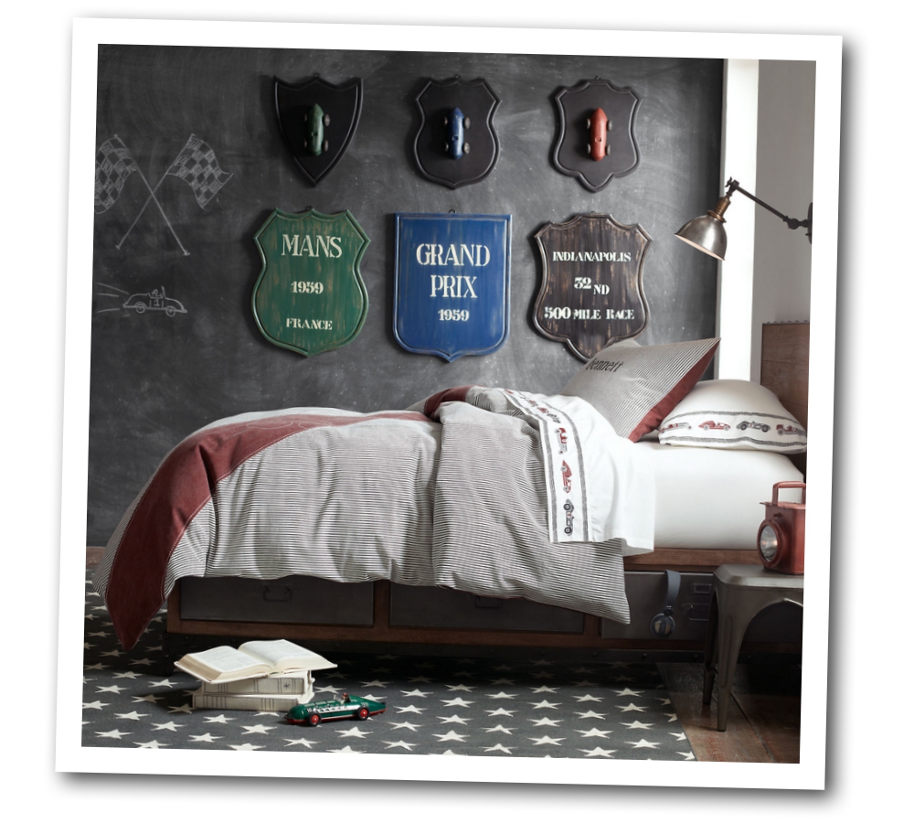
Chalk Board Walls With French Decor For Kids Rooms
Great deals from Amazon:
– 2 Rolls of chalkboard adhesive paper $14 – Amazon
Restoration Hardware featured this boys room and I couldn’t help notice how the chalkboard could be something that can be utilized more than a decorative element. As a parent, you could write out math addition or times tables, or just words of encouragement that your child can read every single day.
Here are some encouraging words that every child should hear more often.
- You are loved
- I have faith in you
- I know you can handle it
- You are creative
- Trust your instincts
- Your ideas are worthwhile
- You are capable
- You are deserving
- You are strong
- You can say no
- Your choices matter
- You make a difference
- Your words are powerful
- Your actions are powerful
- You can learn from your mistakes
- Growing is hard work
- I believe you
- I believe in you
- You are valuable
- You are interesting
- I’m listening
- I’m proud of you
- I’m grateful you’re in my life
- You make me smile
- I love you
Read more of these words of affirmation at bouncebackparenting.com
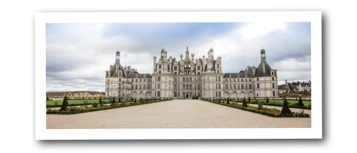
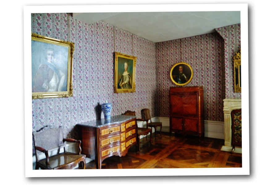
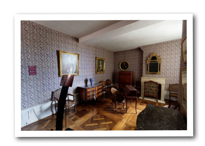
The Rooms Of France’s Chateau De Chambord – French Styled Decorating
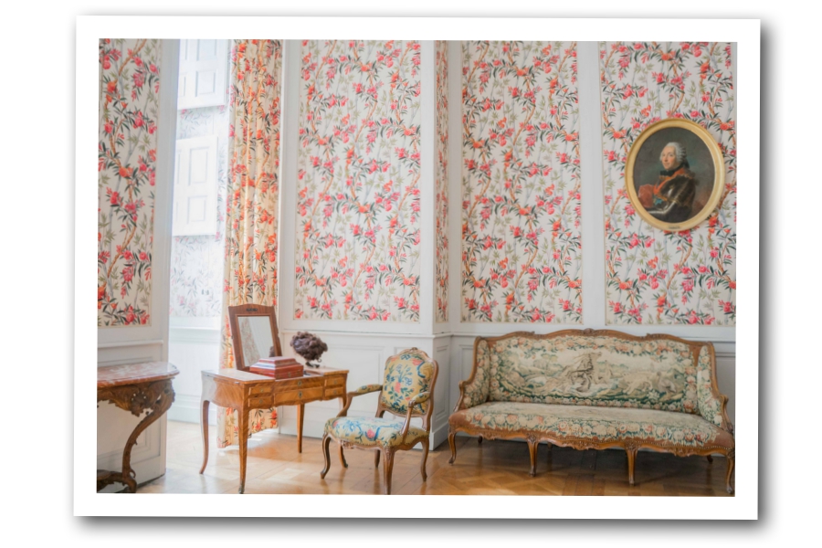
Chateau De Chambord attracts many tourists each year, all hoping to catch a glimpse of this remarkable landmark. The chateau is 2 and a half hours by drive from central Paris. Located in the heart of the Loire Valley between Sully-sur-Loire and Chalonnes, it is the largest chateau in the region; boasting over 400 rooms and 28 staircases. Here are some pictures of this marvelous structure taken from wikipedia.
See more of this beautiful castle here on wikipedia
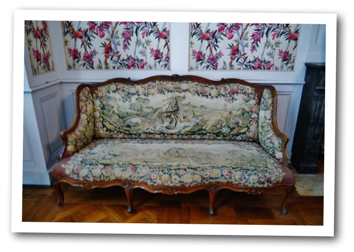
A finer look at this sofa
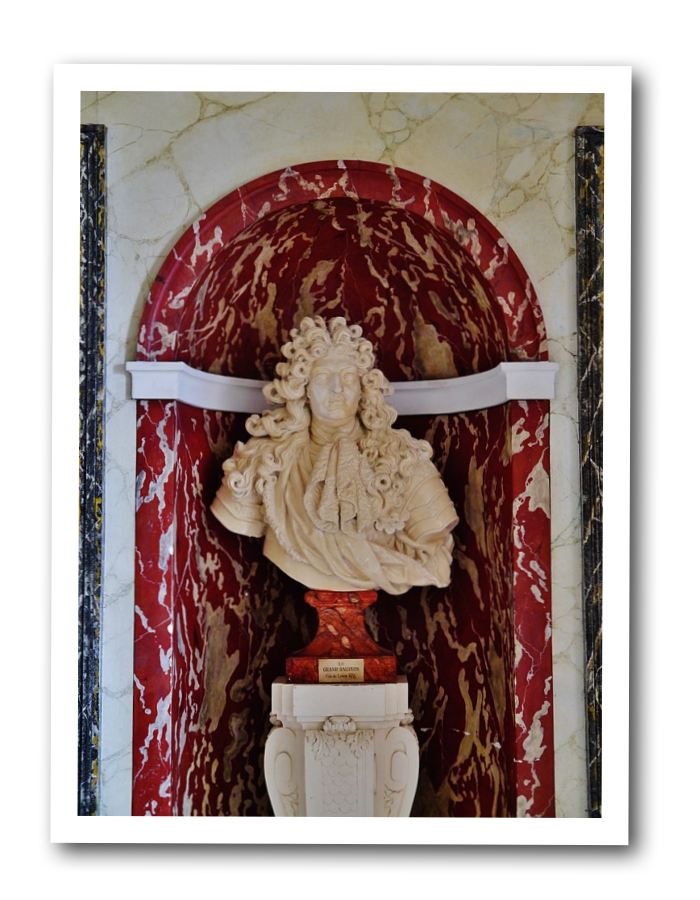
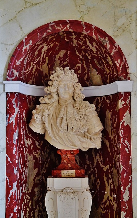
Look at the beautiful stone work set off in red around this bust.
A beautiful room designed around red, white and fuchsia pink
Another angle of this spectacular room.
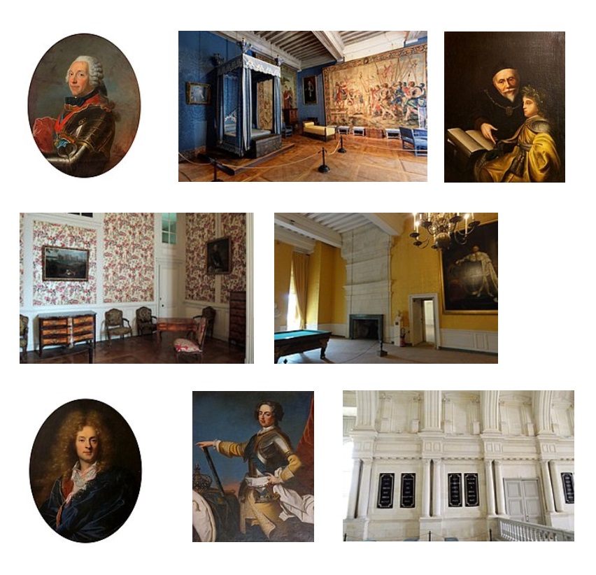
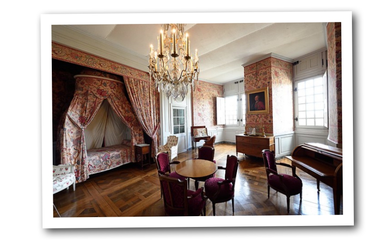
Titled – The Governors Apartment in Chambord Castle France
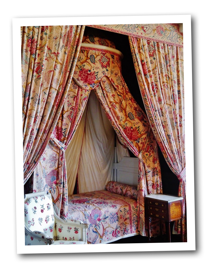
Lush plums and pinks accompany reds in this room designed around this incredible pattern.
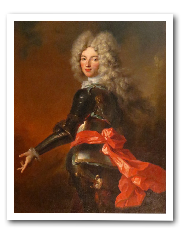
Maximilien Philippe
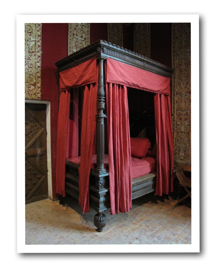
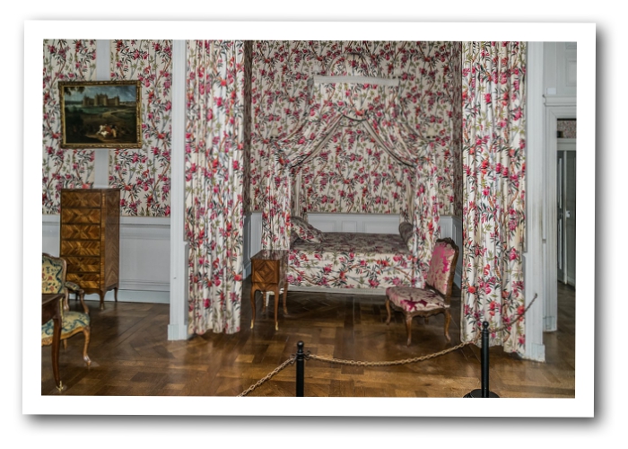
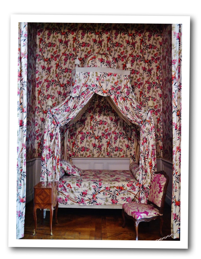
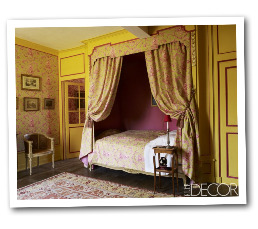
A beautiful canopy bed dressed in red
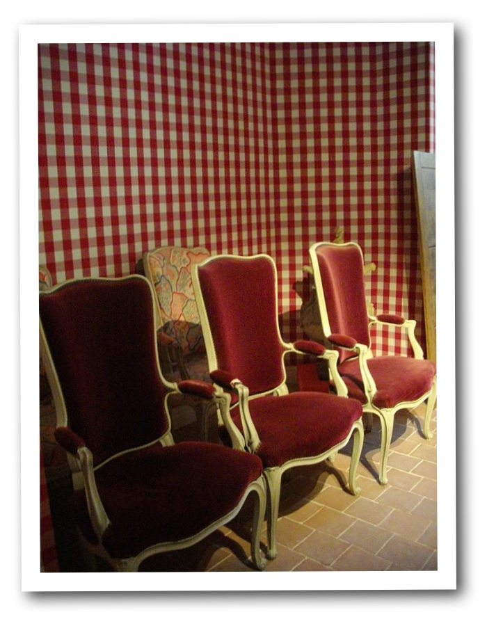
Checked pattern walls in red, with velvet French chairs
A room with a beautiful French wall wallpaper.
Another view of this room
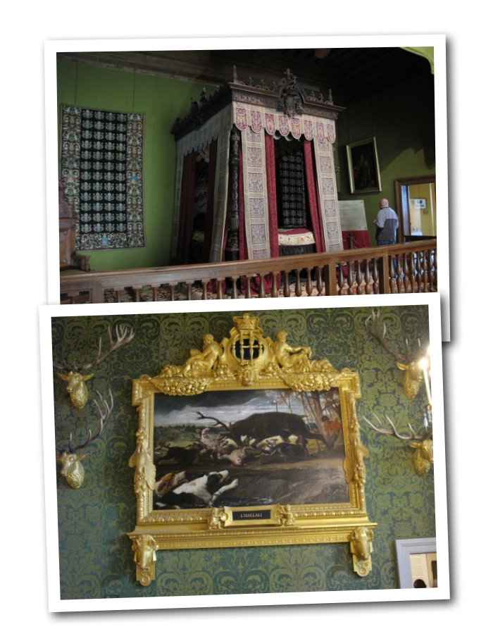
Baroque patterned wallpaper in green with gilt wall paintings.
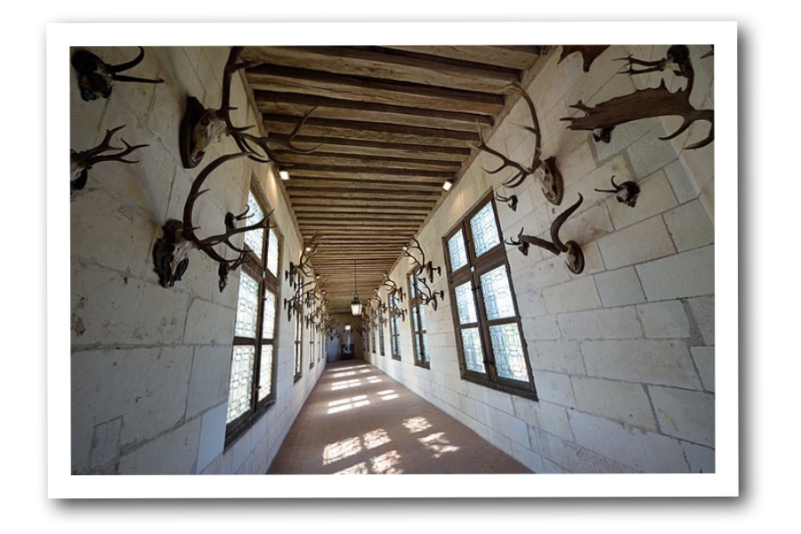
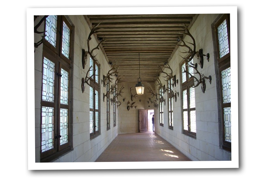
A Trophy Hallway in the Chateau De Chambord
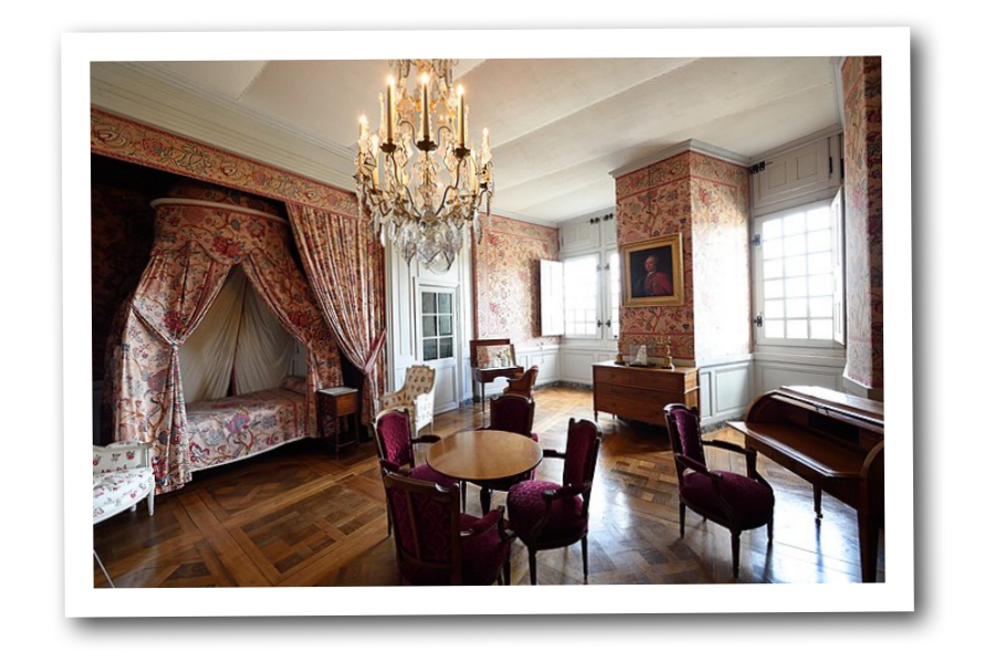
The Governors Apartment in Chambord Castle France
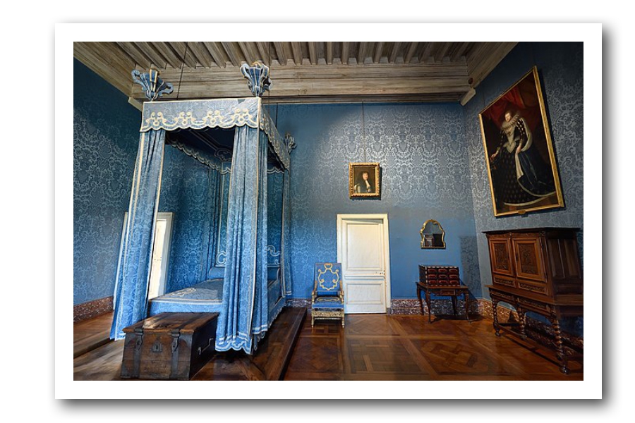
The Queens Apartment In The Chambord Castle France
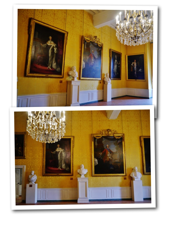
French Yellow and White with Oversized oil paintings in the Chateau De Chambord
French Reds! Moulin Rouge Decorating
Red is a powerful color. If you have ever considered using red in your design layouts, the best way to use it, in my humble opinion, is to use just a touch of it.
Red evokes a strong emotional reaction. If you are looking to de-stress, don’t paint your living room walls with it.
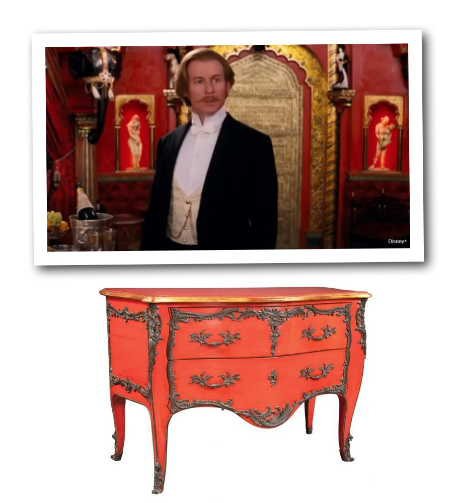
Although, on the other hand red really can command attention. Ideally, you could consider a lacquered red chest and feature it as a center piece in a room.

In this photo, taking a look at the over all amount of color, blue is the dominant color, while red draws you in.
In the Moulin Rouge movie red was a dominant color.
” According to Painter 1, the people of ancient Asia had a strong affinity for red and gold color combinations. They used these hues to showcase status and wealth, “
Read More: How To Decorate Your Home Like The Movie Moulin Rouge – housedigest.com
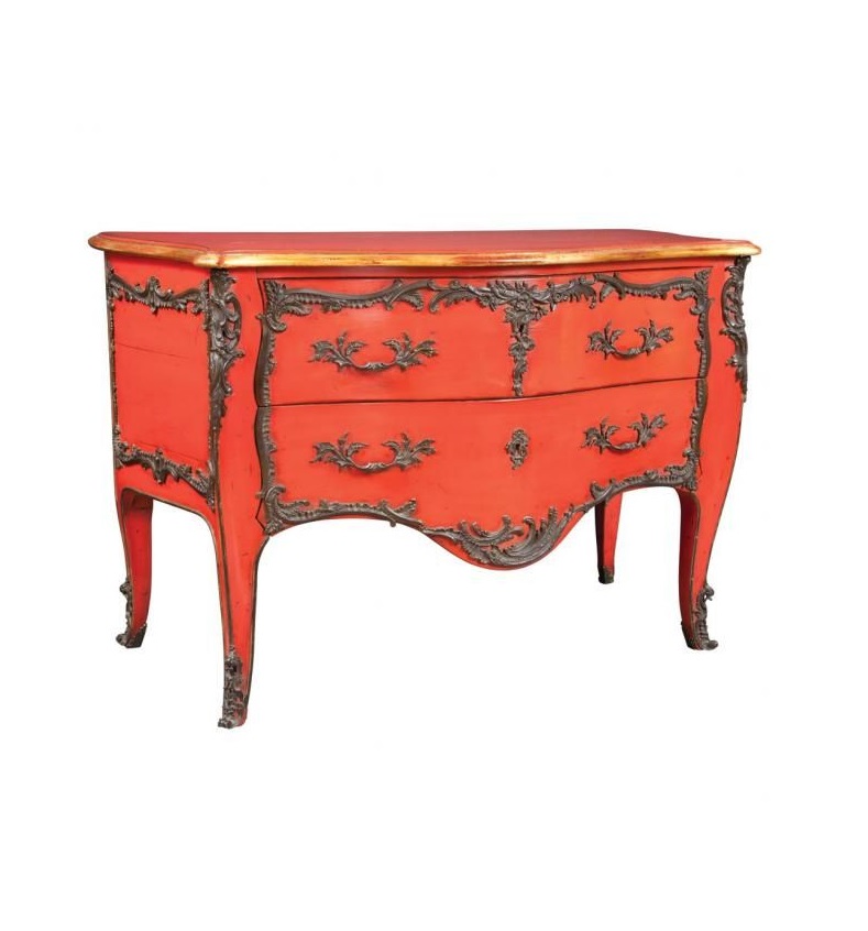
Isn’t this commode spectacular?
Look at the use of bronze and red together.
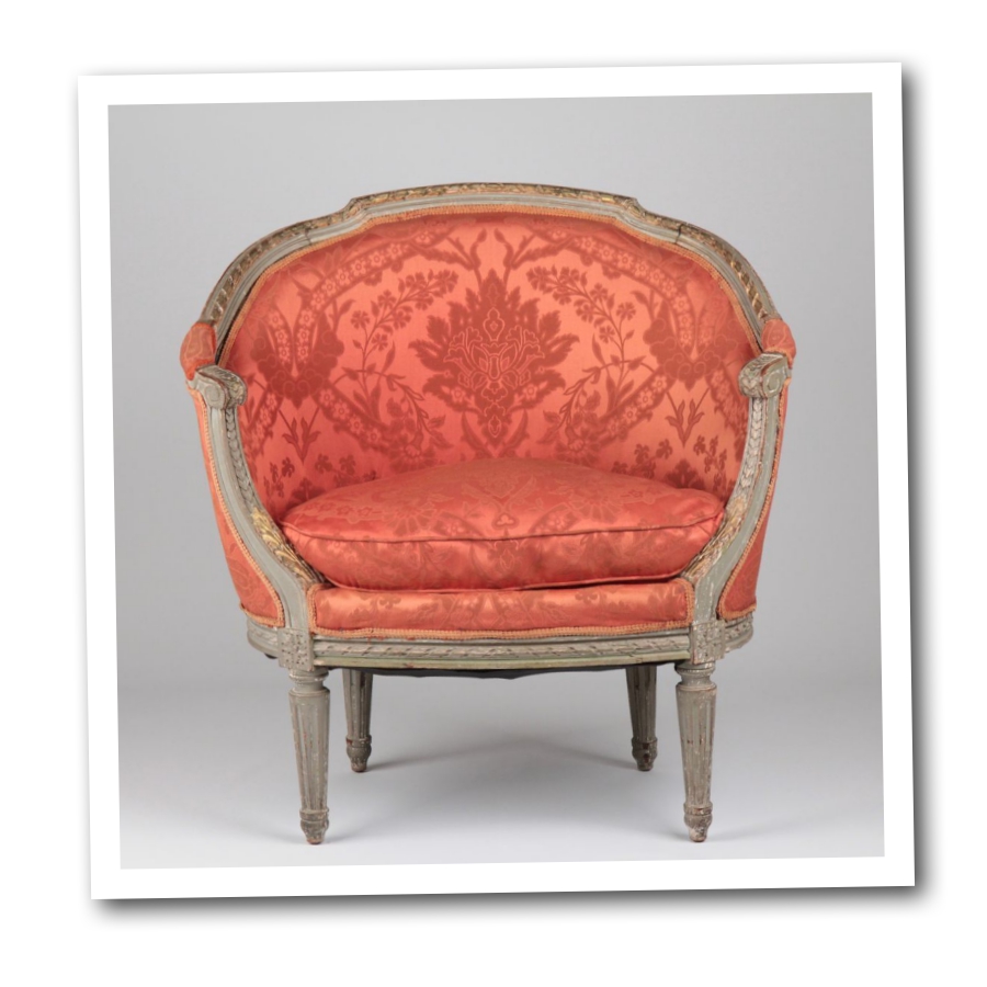
Pair red and gray together.
If you think gold is over the top, gray is the ideal shade to work with as it showcases the red.
You can see that example with this chair.
Combine red with black, and throw pattern into the equation.
Use natural woods with the color of red, and the use of an off white is almost in most color schemes with red.
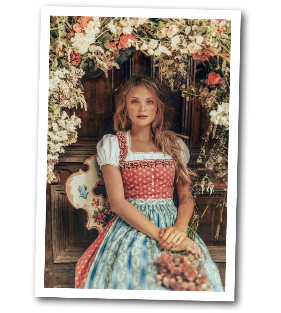
LENA HOSCHEK TRADITION – Frühling/Sommer 2019 ©Rares Peicu – Ossiach Dirndlbluse
Pair blue with red, using just a splash of red. vk.com
A striking combination of red and blue mixed together. – 1stDibs
Red is paired with a creamy white – Lena Hoschek
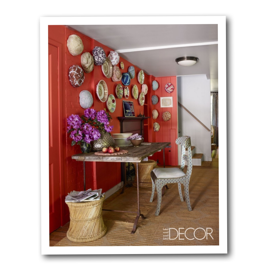
A statement red wall is the perfect anchor for the Dutch plates.
Notice the use of yellow and off white? It is the perfect pairing mixed with a load of patterns.
See this home – John Robshaw’s Connecticut country kitchen
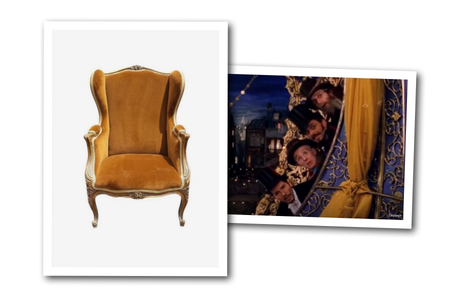
Combine yellow and purple together – Moulin Rouge
French Chair, French Louis XV Style Bergere Armchair – 1st Dibs
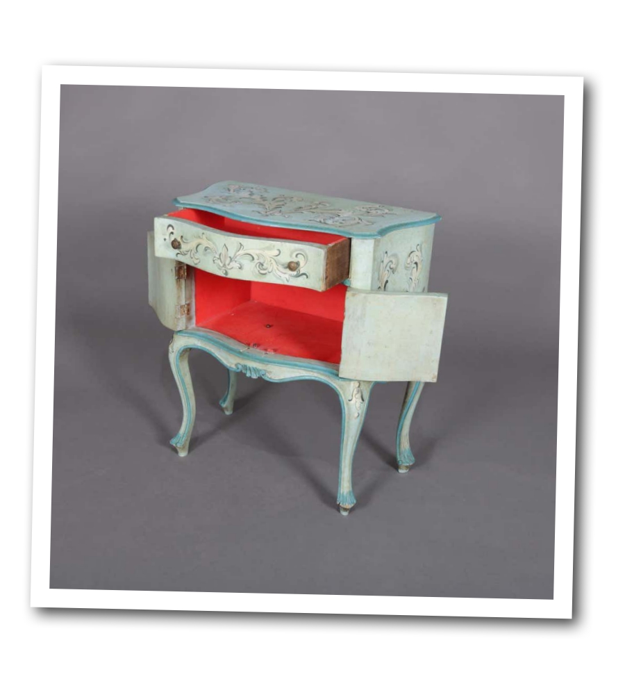
Question – What Paint Colors Work With French Provincial Furniture ?
Question : Was wondering what are popular colors now in style, about to paint a French Provincial chest of drawers and nightstand? Was thinking turquoise but didn’t know if that color was still in? Your opinions appreciated
Becky – There’s so much regional variation in what’s popular, but if I was going to do a turquoise, I would lean more toward a muted teal, sort of along the lines of Benjamin Moore’s color of the year- Aegean Teal. Country Chic has a color I want to try- Jitterbug, which is a sophisticated muted teal. Colors like Fusion’s French Eggshell sell really well for me on french provincial furniture.
Owen – The clue is in the word, French!
Becky – I see French Provincial painted in all sorts of colors successfully, but I think that French Eggshell is a such a subtle and versatile color that it sells well on lots of styles.
Pam – Depends on the style but people seem to like stripes no matter what the color is. Pantones 2021 colors are a deeper yellow (mustard) and medium gray.
Rachel – I’ve been doing this for 10 years. I paint how I feel, I use color! I don’t follow trends.
Isabel – Navy is very big now
Krystal – I hear baby blue’s. I think it’s going to be different every where. Some people are still stuck on Farmhouse style too and last year was Bohemian from articles I read
Jessica – Sold fast Can’t go wrong with White
Monica – White is definitely the quickest seller for me. But French Blue and Gray are tied for second.
Stacey – A mineral blue many shades are now great
Lisa – If you want to sell it quickly -White. I know it’s dull but it always sells.
Lana – I think Navy, Black and white
Paula – Turquoise is over here
Lisa – I’m doing lots of dark blues, white and black
Cheryl – It depends where you live. Unfortunately, where I am it’s basically grey, white, black. Every once in a while we do different colors and wait for the right person to come along.
Marcie – I’ve tried doing colors but they take me a long time to sell. Things I paint white sell right after posting them.
Amy – Lavender, teal, light blue or gray
Alexis – I will be honest, not an “in” color anymore, peaked about 5 years ago. But if you like it and it goes with your decor, who cares? And that doesn’t mean it wouldn’t sell. Other “jewel” tones are popular right now like green and blue (dark).
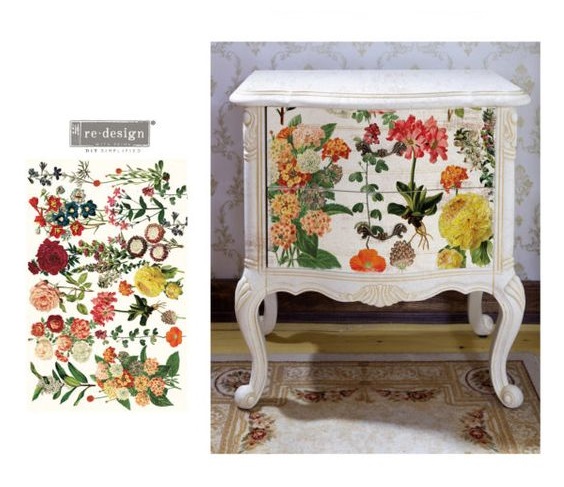
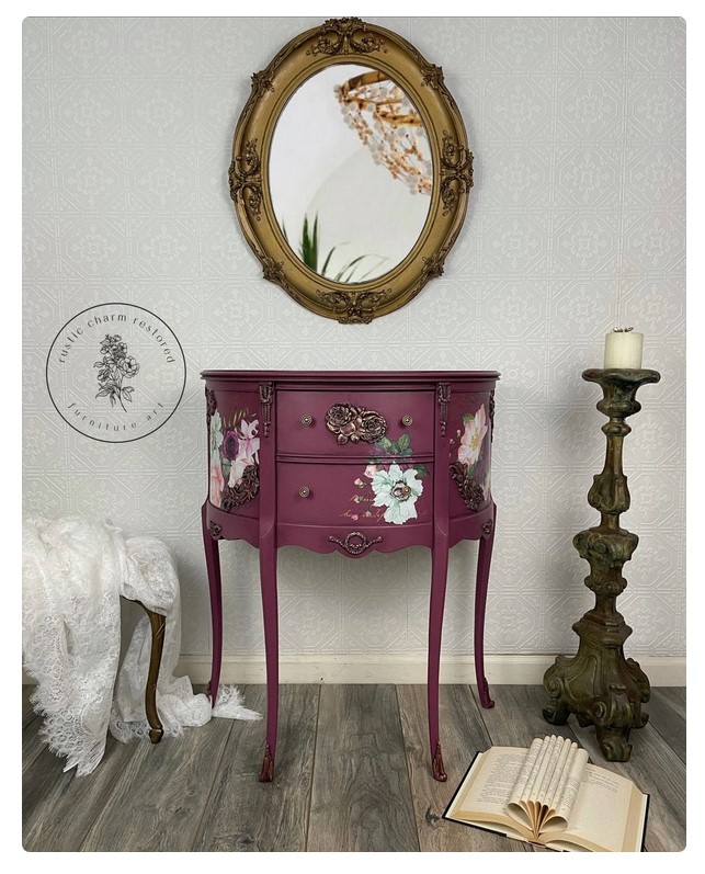
Question – What Is The Best Sealer For Rub On Transfers?
![]()
Kriss asks : What have you found to be the best sealer for rub on transfers?
- Angela – Just use a water based top coat. I’ve use fusion tough coat, GF high performance, varathane Diamond and all are great.
- Roz – Polycrylic.
- Carla – I just use the spray poly. But I use satin. Not fond of Matte.
- Debbie – Dixie Belle clear coat
- Peggy – I would have said polycrylic at one time. But now I have a love/ hate relationship with the stuff. I’m planning to try polyvine. My transfer is over a glaze that dries shinier than I expected and I want to get rid of the shine.
- Vonda – Tough Coat by Fusion. Also there’s a compatibility problem with Gator Hide by Dixie Belle- do not use.
- Vonda – I use a damp sponge. Works great! I’m an IOD Retailer so I’ve done lots of transfers using Tough Coat.
- Vonda – I use the inexpensive auto sponges. I ordered these from Amazon.
- Kiellie – I like Miss Lillian’s Luster line. No issues with it and the transfers
- Jordana – I have used Wise Owl varnish or one hour enamel and it was great.
- Patrick – Earth Safe Finishes Varnish.
- Leslie – I use wise owl furniture salve over transfers.
- Stacy – You shouldn’t use wax over a transfer. It breaks down the transfer
- Cora – I loved how Fusion Stain and Finishing Oil in White looked on this tray. Softened the colors of the transfers, gave the paint a glaze and a tough as nails finish.
- Tallie – Polyacrylic
![]()
Polycrylic Spray – Amazon
Polycrylic – Ultra Matte
Ultra Matte Top Coat Rust-oleum – Amazon
Dixie Belle Matte Top Coat – Amazon
Foam Detailing Applicator Pad – Amazon
Tough Coat by Fusion – Amazon
Here are some matte finish brands ( below ) I have not tried. My go-to finish has always been the polycrylic line. ( The products above in blue ). The reason for that, is over time I found that my white furniture yellowed with other products. Additionally, when I would leave glasses of water on my furniture, it was the ONLY line that repelled the water and did not leave a water stain. Some of the other matte brands did. Even the matte finishes I used outside left horrible stains. The polycrylic brand can be used on wood as well.
Here are a couple brands below I have not tried. I suggest trying them on a few products that can be re-purposed later if they the product ruins the transfer, or wood, yellows or bubbles.
One of the holes I have found in finding a matte product, was the spray application. I like a nice and even finish, and spray is what gives me that look. I also prefer matte over satin because as you view the furniture on the side, you won’t see any lines, creases or wrinkles in your project.
![]()
Aleene’s Spray Finish – Amazon
Rust-Oleum – Clear – Amazon
Varathane In Matte – Amazon
Krylon In Matte – Amazon
Rust-Oleum In Matte Clear – Amazon
![]()
![]()