Provence Decorating: HOW TO Decorate With Green

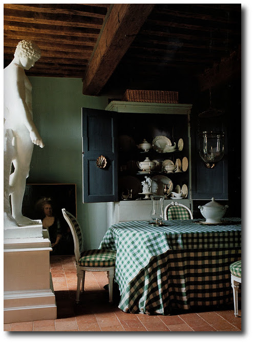
18th Century Manor House – The World of Interiors, Jun 2005-Seen on Genus Loci Blog
The color green is one of the most popular colors to decorate a French home around. A cool green can can create a cool, calm, soothing atmosphere to feel refreshed in, while a darker greens can create warmth and comfort.
1. Mix Your Shades
Pick out your wall colors first, then introduce other shades of green elsewhere. If everything is one hue, it can be a bit drab, consider pairing strong greens with mild ones. Consider brighter colors with darker colors. Dark shades of green look great with punches of lime, or yellow.
2. Bring in Natural Wood
Natural wood and white accents do a good job of balancing brighter shades of green and keep them from becoming overwhelming. To keep the room light and airy, paint ceilings and trim white, or a lighter color tone of your wall color. Adding raw wood, such as a desk, or side chairs can level out the color. Consider adding in painted black accessories or furniture to add contrast. Stainless steel, tile and wood will give your room a balance against pastel colors.
3. Use The Brighter Shades on The Ceiling
Who says the ceiling is off limits? Are lighter colors more you? Making a dramatic statement, by painting the ceiling the vibrant color you want, but feel doesn’t belong on the walls. Consider painting the wall colors a really soft shade of light green that is border line white, and punch up the ceiling with a brighter tone of the same shade.
Color Combinations:
Green + Shades of Purple
Green can blend with a variety of colors and looks wonderful with opposites. Pair green with lighter lilacs, and darker eggplant accents. Shades of mauve, periwinkle, amethyst and lavender-based colors can be paired with lighter shades of green.
Lavender is the color and scent of Provence. The history of lavender stretches back more than 2,000 years. In France, lavender grows in both cultivated fields and wild along the side of the road, so it was no wonder that it became a popular interior color. Chefs have used the flower as a herb in sweet and savory dishes and its nectar to flavor honey, cheese and sugar. Lavender is a light tone of violet. The name comes from the flower of the lavender plant. The color of the flower is still the standard for lavender but there are many other tones of light or medium violet now called lavender also. Their are shades of lavender can range in hue from pinkish purple through violet to blueish-indigo. They can also range from light and pale to medium and greyish shades.
Green + Bright Yellow
Green also pairs well with brighter colors. Think about bright sunshine yellow paired with this gray based green. Green also works well with brown combinations which can bring a sense of coziness and tranquility. Bright yellow actually gives a punch of color in a room based around a gray toned green. Consider adding in black painted furniture with brighter yellow upholstery for contrast.
Green + Kelly Green + Green Blue
Play several like ranged colors together. When combined with vivid jewel tones such as Kelly green, and a green-blue range suggests a tenderness. Light green and sky blue can be enhanced by white for extra freshness.
The trick to green in French interiors is the gray undertones. Whether they are pale or strong, there is always a gray or black in the background. Subtle interiors were a mark of the Provence style interiors.
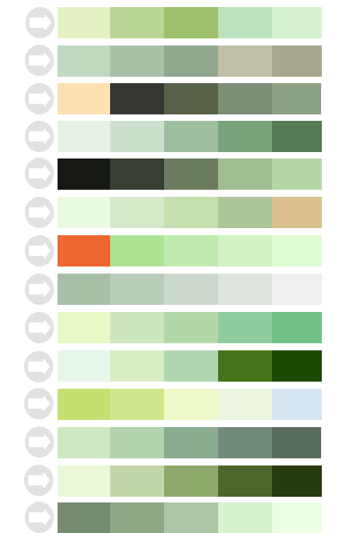
Colors To Pair With Minty Green
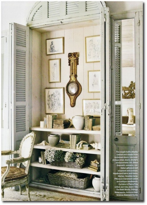
Patina Style by Brooke Giannetti and Steve Giannetti


